drawing, print, paper, ink, engraving, architecture
#
drawing
#
neoclacissism
# print
#
perspective
#
paper
#
form
#
ink
#
line
#
cityscape
#
academic-art
#
decorative-art
#
engraving
#
architecture
#
realism
Dimensions: height 330 mm, width 205 mm
Copyright: Rijks Museum: Open Domain
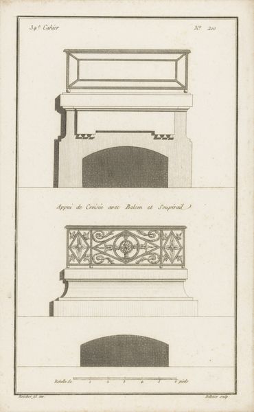
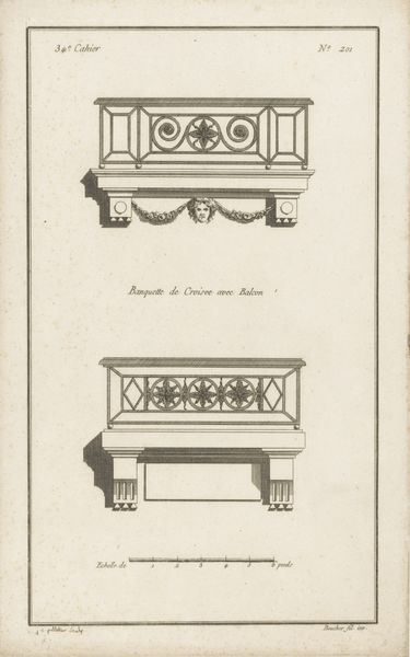
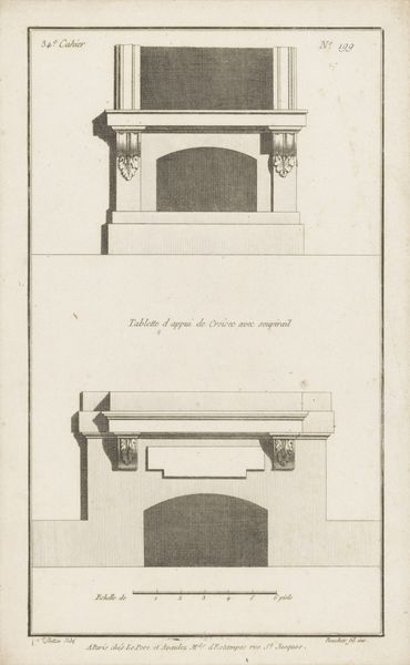
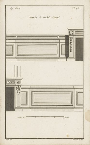
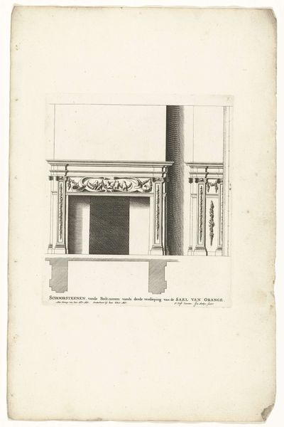
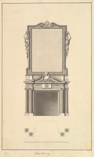
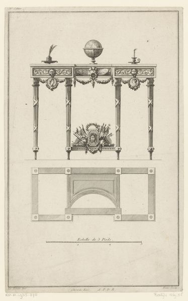
Curator: This engraving from between 1772 and 1779, titled "Twee vensterbanken" by Jean Pelletier, showcases a pair of window sills. At first glance, I’m drawn to its stark, almost technical presentation. Editor: The linearity is quite striking, and the flatness of the image emphasizes the architectural nature. It lacks warmth, it feels like a blueprint stripped of context. It gives me pause to think about what kind of societal purpose and context these architectural drawings had in their own time and culture. Curator: Absolutely. Pelletier has employed line engraving to meticulously depict the structure. One is mounted, the other free-standing, but both seem designed to emphasize proportion and form within an architectural space. You'll also note the precision of the draftsmanship. It's really quite beautiful as a physical object. Editor: It does reveal an intriguing tension between representation and lived space. The artist is laying bare the geometry of a window, yet these windows remain symbols of bourgeois comfort, structures that serve to protect and conceal. The absence of people here becomes pronounced. The labor is unseen but certainly implied. Who fabricated this design? Whose window is this? Curator: The use of ink on paper allowed for dissemination through prints. The act of printing meant that others in the community could produce them—or maybe even realize similar designs for themselves. Consider also the Neoclassical elements—the fluting, the symmetry, all pointing toward ideas of order and progress that were of import in the Enlightenment. Editor: So while it initially presents itself as simply a rendering of design, it's embedded within a value system—access to resources, production for mass appeal, gendered roles inside domestic settings... the aesthetic presentation masks deeper, often unseen hierarchies of 18th century class structures. Curator: I find myself seeing in these stylized designs a drive towards idealizing and ordering one's environment. How interesting to consider this emphasis on aesthetic purity during the revolutionary periods. Editor: Agreed. Looking closely at the technical skill interwoven with aesthetic choices does underscore its powerful commentary about social structures and the nature of seeing itself. It definitely invites a continued unpacking.
Comments
No comments
Be the first to comment and join the conversation on the ultimate creative platform.
More like this