drawing, graphic-art, typography, ink, pen, poster
#
drawing
#
graphic-art
#
script typography
#
hand-lettering
#
lettering
#
playful lettering
#
hand drawn type
#
hand lettering
#
typography
#
ink
#
hand-drawn typeface
#
pen work
#
pen
#
handwritten font
#
decorative-art
#
poster
#
calligraphy
#
small lettering
Copyright: Public Domain: Artvee
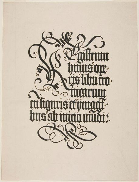
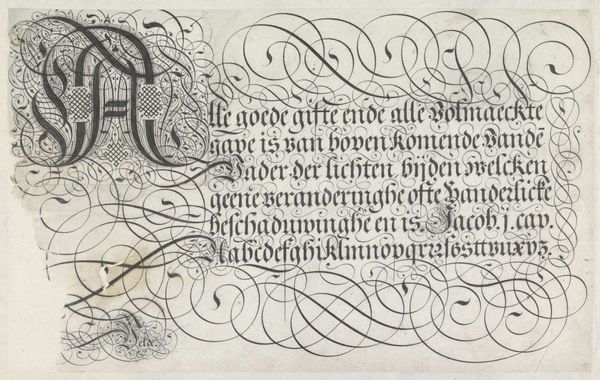
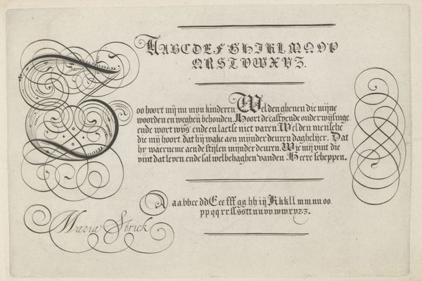
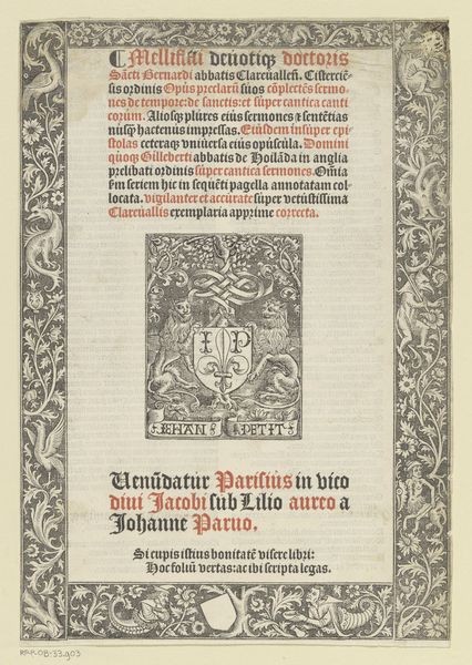
This title page design for Scribner’s Magazine was created by Edwin Austin Abbey, likely using pen and ink on paper. The lettering is done in a gothic style, reminiscent of illuminated manuscripts. The use of red ink for emphasis, along with elaborate initial capitals, further connects it to this historical tradition. But here's where it gets interesting: Abbey was designing this page for a mass-produced magazine. His work would have been translated into a printing plate, multiplied thousands of times, and bound into a cheap, widely distributed periodical. He was engaging in a mechanized form of production far removed from the hand-craftsmanship that his design evoked. The contrast highlights a tension at the heart of the Arts and Crafts movement, which flourished at the time: a nostalgia for pre-industrial making, even as artists and designers grappled with the realities of mass culture. The materials, the making, and the social context - all are essential to understanding the meaning of this compelling work.
Comments
No comments
Be the first to comment and join the conversation on the ultimate creative platform.
More like this