drawing, print, ink, engraving
#
drawing
#
medieval
# print
#
pen illustration
#
old engraving style
#
11_renaissance
#
ink
#
geometric
#
pen-ink sketch
#
line
#
pen work
#
sketchbook drawing
#
engraving
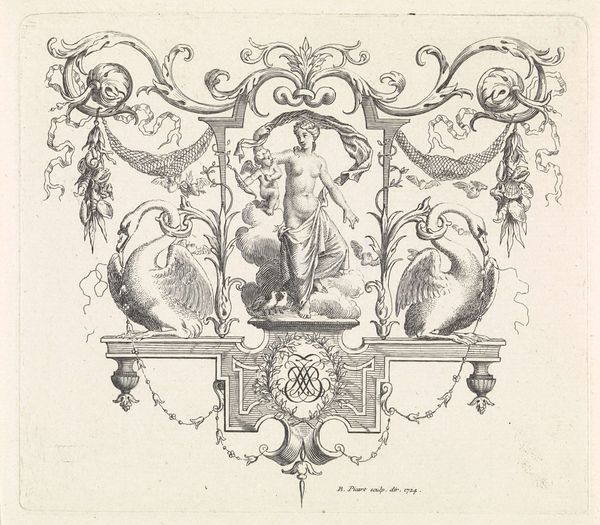
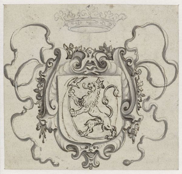
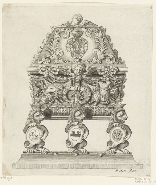
Dimensions: height 227 mm, width 287 mm
Copyright: Rijks Museum: Open Domain
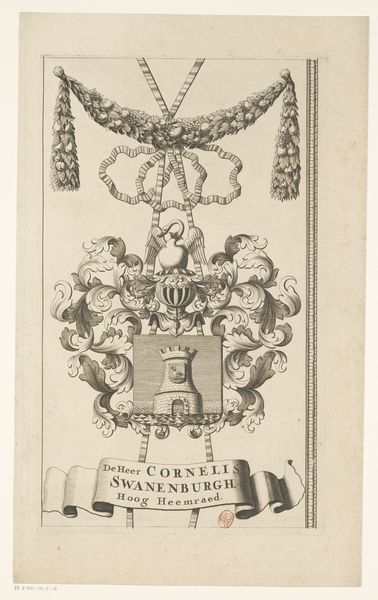
Editor: This engraving, "Wapenrand van een kaart van de Alblasserwaard en de Vijfheerenlanden (deel)," dates back to 1716 and appears to be unsigned. It's a detailed study in ink and printmaking— the composition strikes me as quite ornate. What elements jump out at you? Curator: Initially, it is the balance. The crest, ribbons, lion and base; it achieves a harmonious arrangement. Look at how the artist contrasts textures; the smooth ribbons, the rough fur of the lion. How do you interpret this choice in materials? Editor: I think that those textural contrasts definitely heighten the visual interest. It prevents the composition from becoming flat. Is there any meaning or purpose behind the level of detail? Curator: Consider how each flourish contributes to the work’s complex layering, and examine the relationship between form and function. How does line dictate meaning within this piece? Editor: I hadn't considered how much the line quality impacts it, but I agree it emphasizes precision. So it's the deliberate application of these intrinsic formal choices, line, form and contrast that build its visual richness? Curator: Precisely. And do those help us consider a purpose? In a semiotic reading, we would consider that visual rhetoric carefully. The linear execution defines the crests elements within a rigid design, yet achieves fluid lines. This juxtaposition communicates controlled strength. Editor: That's fascinating; I now see a new depth to the image and what I originally viewed as just embellishment. I appreciate your viewpoint, Curator! Curator: The piece’s beauty lies in its structural elements. I am so pleased that we were able to unpack some of the formal vocabulary today.
Comments
No comments
Be the first to comment and join the conversation on the ultimate creative platform.
More like this