Copyright: Public domain
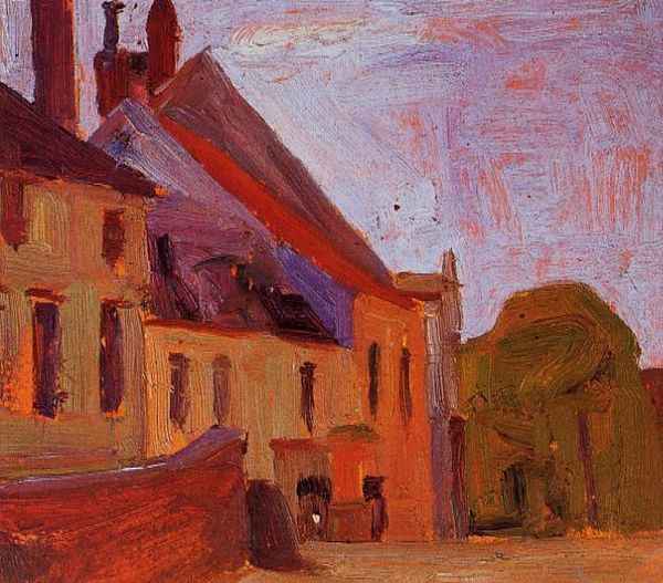
Editor: Here we have Clarence Gagnon's "The Campo, Sienne," painted in 1911 using oil paints in a plein-air style. The texture is amazing – it almost vibrates with light. What strikes you most about its composition? Curator: Primarily, the juxtaposition of the planar surfaces that delineate the buildings and the open space against the heavily impastoed sky creates a fascinating tension. Note the artist's calculated use of complementary color schemes, particularly how the blues and yellows heighten the architectural forms, generating a powerful, evocative spatial experience. Do you perceive how the structure organizes this composition? Editor: I think the tower definitely commands attention, sort of anchoring the whole scene vertically. Is that what you mean? Curator: Precisely. Gagnon strategically uses verticality to interrupt and complicate our horizontal apprehension of space, further activating a play of geometrical ordering which structures the overall affect. Notice too the directionality of the brushstrokes—how they subtly lead the eye across the picture plane. Consider the work as a self-contained system, the interplay of elements producing a rich visual dynamic. Editor: It’s like the brushstrokes themselves are tiny architectural elements! I never considered how much the texture could influence the feeling of space. Curator: Indeed! Examining the formal properties allows us deeper insight, shifting away from a mere mimetic appreciation towards understanding the work as a structured visual statement. What we've learned today, focusing on composition and color theory, highlights the way Gagnon orchestrates visual language itself to shape perception and affect.
Comments
No comments
Be the first to comment and join the conversation on the ultimate creative platform.