drawing, print, paper, ink, architecture
drawing
baroque
paper
form
ink
geometric
line
architecture
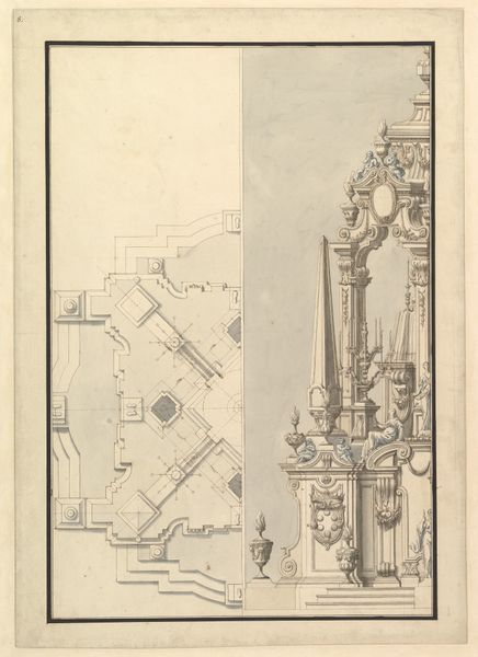
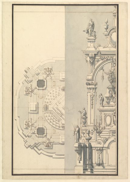
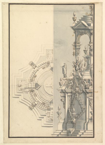
Dimensions: sheet: 15 1/2 x 19 7/16 in. (39.4 x 49.4 cm)
Copyright: Public Domain
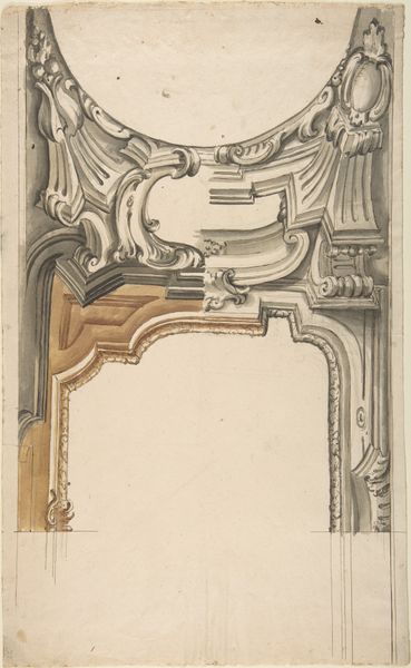
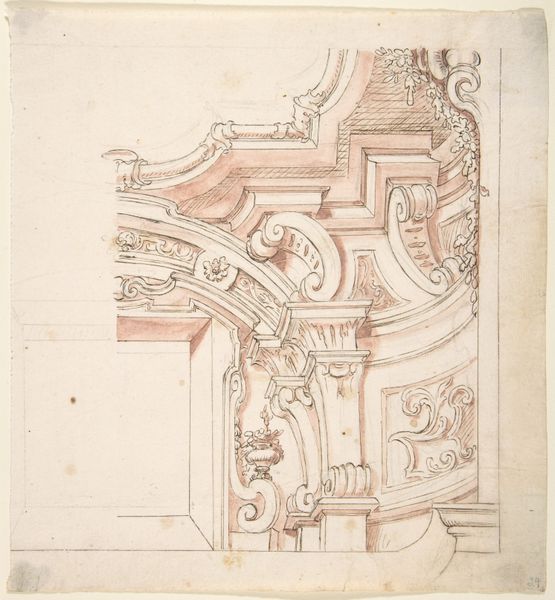
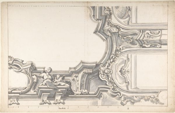
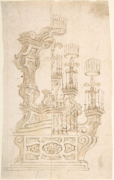
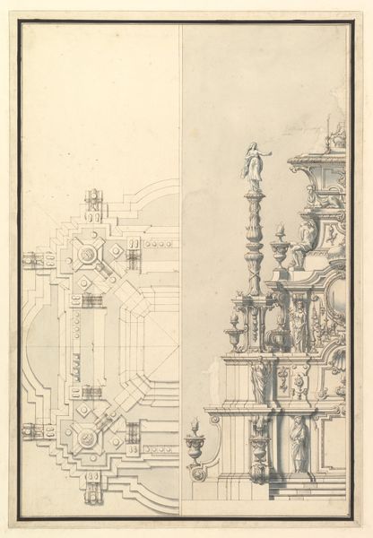
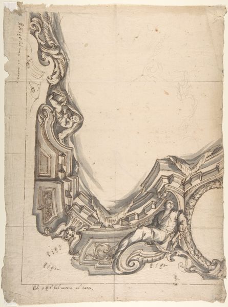
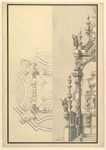
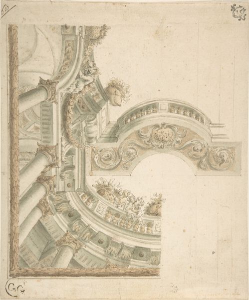
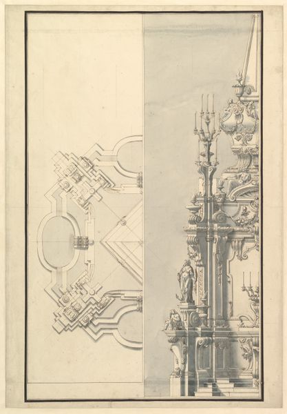
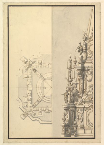
Here we see an anonymous design for a cornice, rendered in pen and brown ink with gray wash, offering an insight into architectural ornamentation. The drawing presents a complex interplay of forms. A tapestry of moldings, volutes, and stylized floral motifs. The artist uses depth and relief through careful shading. Note how linear precision is combined with fluid washes to articulate each element, from the robust brackets to the delicate friezes. The varying tones create a hierarchy where the eye is led through the composition. This design speaks to the era’s obsession with detail and opulence. The cornice is not merely a structural component but a statement. The artist seems to engage with semiotic systems, using recognizable motifs to convey messages of power, status, and cultural sophistication. Consider the relationship between structure and decoration. Does it serve to support or to communicate a visual message? The interplay of light and shadow and its dynamic composition invites us to consider how space is not just enclosed, but actively shaped by artistic vision.
Comments
No comments
Be the first to comment and join the conversation on the ultimate creative platform.