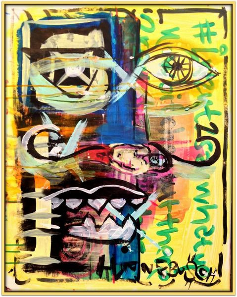
Dimensions: 61 x 46 cm
Copyright: David Michael Hinnebusch,Fair Use
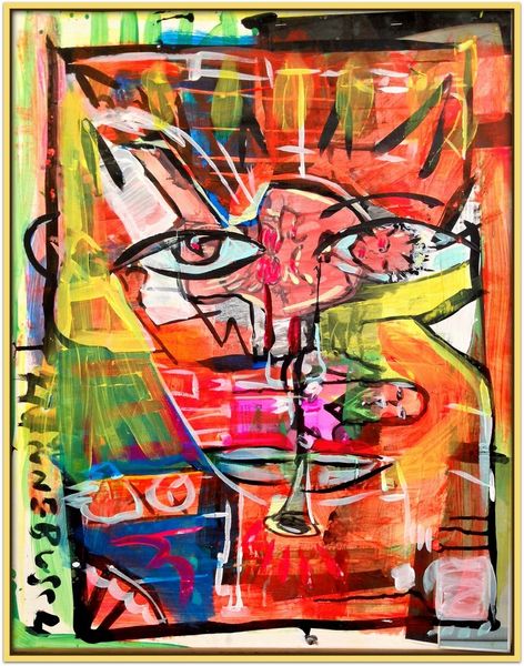
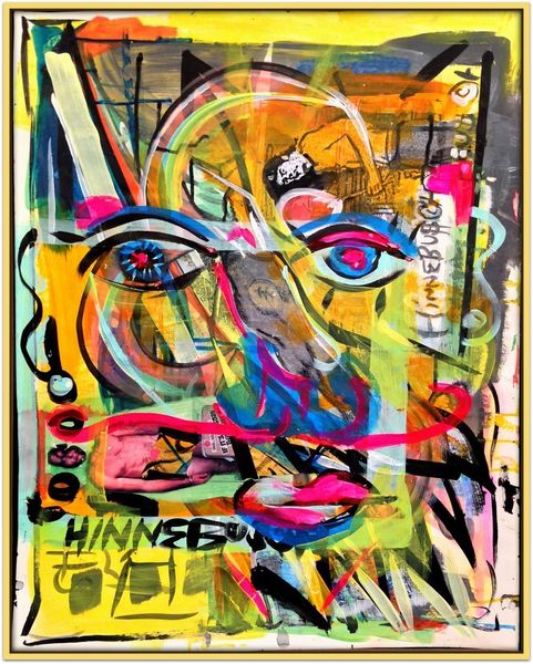
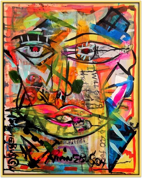
Editor: This is "Stop Clock," a mixed-media work by David Michael Hinnebusch, created in 2016. It definitely has an intense vibe, the colors and abstract shapes create a rather striking visual. What do you see in this piece? Curator: Formally, the composition relies on contrasting textures. Notice the tension between the gestural, almost frantic application of acrylic paint, and the deliberate, linear quality of the black lines that define the facial features. The central eye motif is also quite compelling, don't you think? Editor: Yes, the eye definitely dominates the piece! It’s hard to miss it. I also find the green accents a bit out of place. What purpose do you think they serve in the overall structure of the image? Curator: I think the splashes of green function as disruptive elements, preventing the eye from settling comfortably on any one area. It’s as if the artist is actively working against visual harmony. Consider also how the limited palette – dominated by reds and yellows – creates a sense of unease that those contrasting accents emphasize. Does that resonance strike you? Editor: I see that. So it’s not just about the colors themselves, but how they interact and prevent a sense of resolution within the composition. The eye sees but cannot understand. Curator: Precisely! The formal elements here—color, line, texture—conspire to create a feeling of perpetual incompletion, an open-endedness that resists easy interpretation. Editor: That really changes my perspective on the piece. I was so focused on the "what" that I didn't consider the "how". Curator: Indeed, the 'how' allows for multiple interpretations. A fruitful encounter.
Comments
No comments
Be the first to comment and join the conversation on the ultimate creative platform.
More like this