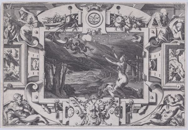
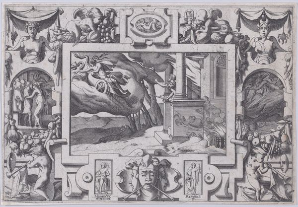
print, engraving
# print
#
pen sketch
#
old engraving style
#
figuration
#
line
#
history-painting
#
engraving
Dimensions: height 64 mm, width 55 mm
Copyright: Rijks Museum: Open Domain
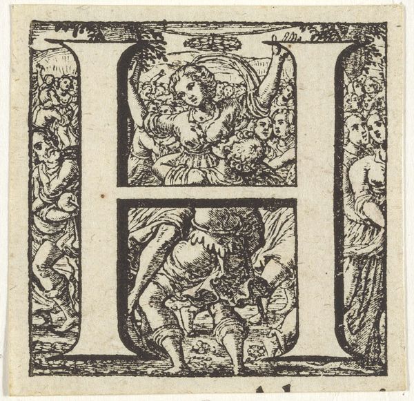
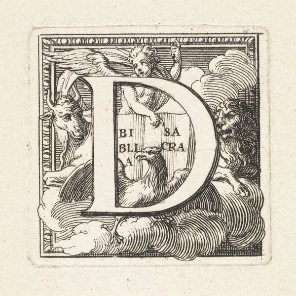
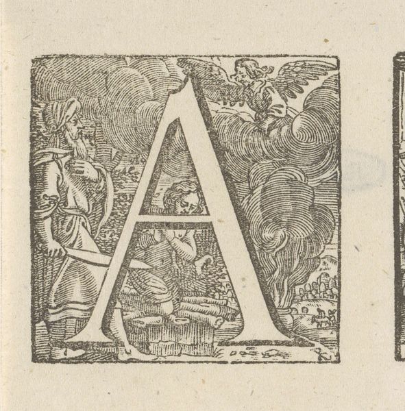
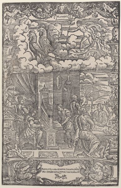
Curator: This engraving, "Initial H with the Annunciation to the Shepherds," was created by Hermanus Numan, sometime between 1754 and 1825. It resides here at the Rijksmuseum, a small but intricate print. Editor: The first thing that strikes me is how delicately the scenes are rendered within the strong, bold shape of the letter "H." It feels like a world contained, doesn't it? Curator: Exactly. The initial is more than decorative; it provides the structural framework for a theological narrative. See how the upper portion illustrates the heavenly host appearing to the shepherds depicted below? Editor: The Annunciation. And Numan anchors it further by including scenes that frame both sides of the letter, one to our left looking more wild, one on the right seeming like they are protecting or guarding a camp. In that period, what did this kind of visual encapsulation communicate? Curator: The 'H' perhaps signifying hope, held within boundaries, and bestowed from above. The engraver utilizes a crisp, clean line, typical of engravings, but there’s also a surprising amount of expressive detail crammed in—especially if you zoom way in and look closely. Editor: I'm drawn to the body language of the shepherds; how they flail, react, and hold their arms up as if blinded. A really astute capture of power dynamics, both earthly and divine. Their reaction says much about societal structure—how a divine message might appear as overwhelming or incomprehensible to the working classes. How it challenges ideas around revelation being neutral. Curator: I like how you are connecting revelation to reception. The execution, using only lines to define shape and texture, amplifies this sense of revelation emerging from the darkness. Look at those swirling clouds. Almost like the very medium echoes the message. Editor: This wasn't just religious iconography, it's art embedded with the social and class anxieties of its time. Considering the rise of Enlightenment thinking, it suggests a negotiation— or maybe a tension between traditional beliefs and newer perspectives. Curator: An 'H' for Holding, for Hope… maybe even History itself in its constant state of revealing, if we just remember to really look. Editor: A beautiful articulation. Perhaps, even 'H' for holding space for a challenging dialogue of faith and class and history that’s still resonating centuries later.
Comments
No comments
Be the first to comment and join the conversation on the ultimate creative platform.
More like this