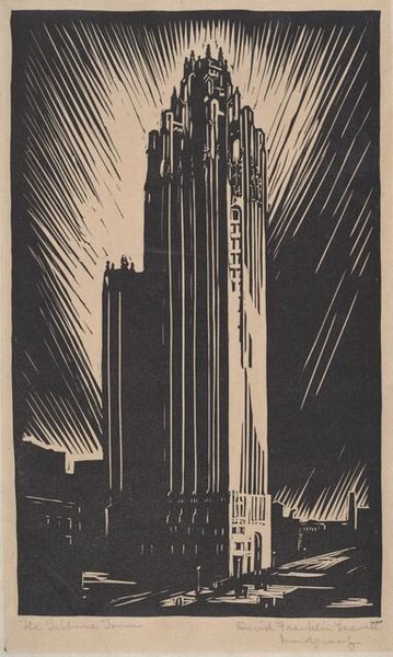
graphic-art, print
#
graphic-art
# print
#
geometric
#
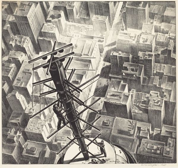
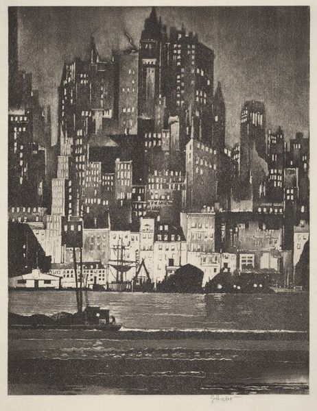
cityscape
#
modernism
#
monochrome
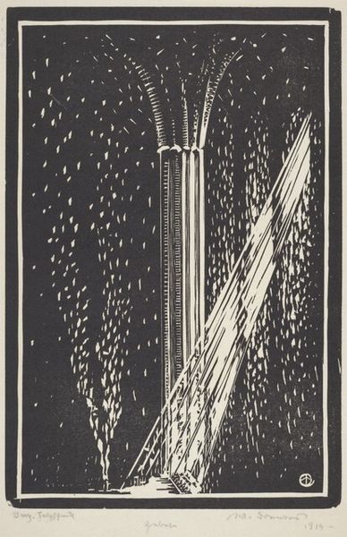
Dimensions: Image: 453 x 351 mm Sheet: 548 x 430 mm
Copyright: National Gallery of Art: CC0 1.0
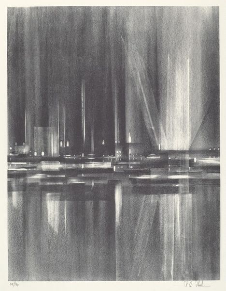
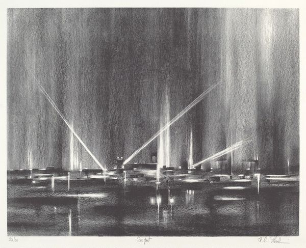
Curator: "Lights," created in 1963 by Richard Florsheim. The medium used for this particular piece is printmaking. Editor: It strikes me as a haunting vision of urban space, this monochromatic print. The composition feels so heavy and atmospheric, and the texture—clearly achieved through meticulous layering in the printmaking process—adds to the sense of almost dreamlike decay. Curator: Decay isn't a word I'd immediately jump to, but I see where you're coming from. Perhaps it's the absence of vivid color or the graphic, geometric nature of the architecture that creates a certain...aloofness. Florsheim really focused on American cityscapes, these quiet moments in buzzing urban landscapes. Editor: I appreciate that aloofness, though. What about the materials themselves? Consider the paper stock Florsheim would have used, likely mass-produced. The labor-intensive act of printmaking becomes all the more poignant against that backdrop. It speaks to the commodification of urban spaces, right? All this industry churning, building…and what are we left with? Curator: A ghost of grandeur, perhaps? I get the impression you feel quite strongly that there's some critique being leveled about labor, mass culture here... But I sense that Florsheim just wanted to find something quietly moving amidst the city lights, find his way among those streets. Editor: Maybe it's both. These aren’t handmade etchings, meticulously crafted luxury items. They are repeatable, reproducible – just like the architecture they depict. But I can't ignore the craft element that remains! Each print slightly different depending on the skill of the artist, the pressure applied, or imperfections in the matrix. Even within mass production there’s room for human intervention, and yes...beauty. Curator: The beams of light that slash through the print - are they aspirational or oppressive? Do they promise hope or surveillance? Florsheim has really caught this perfect balance where the meaning becomes your own to figure out. Editor: I’d say in the context of post-war, modernist cityscapes, those rigid beams might lean more towards systems of control. But you're right; Florsheim does leave enough space for viewers to find their own emotional response. It’s quite generous, really. Curator: A moment of visual poetry then. Perhaps we agree after all. Editor: Precisely! The confluence of rigid geometric shapes and this underlying sensitivity truly makes this print sing.
Comments
No comments
Be the first to comment and join the conversation on the ultimate creative platform.
More like this