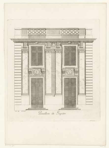
drawing, print, ink, pencil, architecture
drawing
neoclacissism
form
ink
geometric
pencil
line
architecture
Dimensions: 5 1/4 x 5 1/8 in. (13.4 x 13 cm)
Copyright: Public Domain
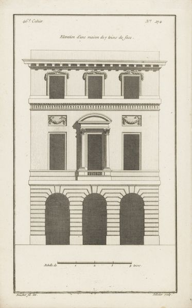
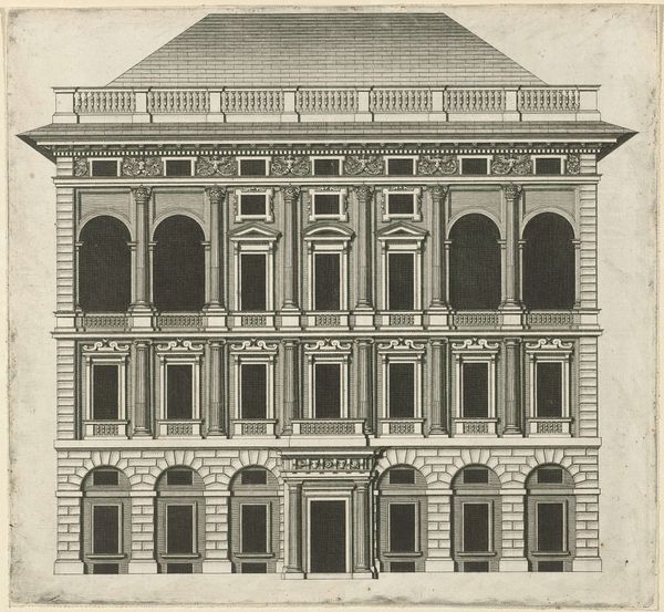
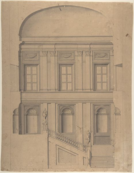
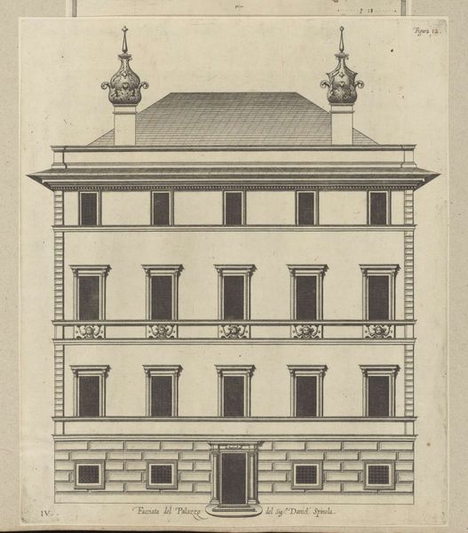
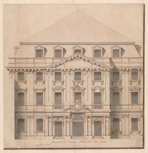
Editor: This is Claude Nicolas Ledoux’s "Design for a Stage Set," dating roughly from 1736 to 1806, rendered in pencil, ink and print. I'm immediately struck by how this design seems to flatten and abstract the idea of architecture; almost like a critique. What are your thoughts on it? Curator: The key is to look at this design through a materialist lens, considering its means of production and circulation. Notice how the drawing itself—the paper, ink, the labor involved in its creation—was integral to disseminating Ledoux's architectural theories. Editor: How so? Curator: Well, consider the social context. Ledoux, like many architects of his time, used drawings and prints to reach a wider audience. He used them to showcase radical designs, to challenge established ideas about what architecture *should* be. How does the design present a tension between luxury and functionality? Editor: I see that now. It presents a tension between geometric form and luxurious ornamentation. The ornamentation looks printed – cheap almost. Curator: Exactly! The stage set is designed, printed and distributed. Not built out of stone. That mass production undermines traditional artistic values tied to individual craftsmanship. This reflects a changing economic landscape and new modes of art consumption, wouldn’t you say? Editor: Definitely. It makes me think about the shift from unique artwork to mass produced consumer objects. Curator: Precisely. Ledoux's work embodies that very transition, pushing the boundaries of what constitutes “high art.” Examining these sorts of drawings and considering their distribution can unlock our understanding of artistic labour and socio-economic shifts of that era. Editor: I hadn't considered how the design itself, its accessibility as a drawing, shapes its meaning. Thanks, that was really enlightening.
Comments
No comments
Be the first to comment and join the conversation on the ultimate creative platform.