graphic-art, poster
#
sport poster
#
art-deco
#
graphic-art
#
geometric
#
cityscape
#
poster
Copyright: Public Domain: Artvee
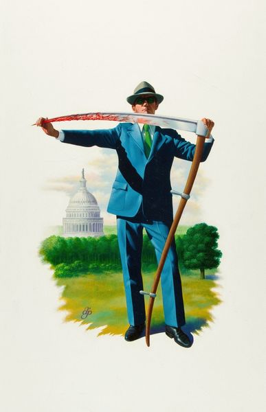
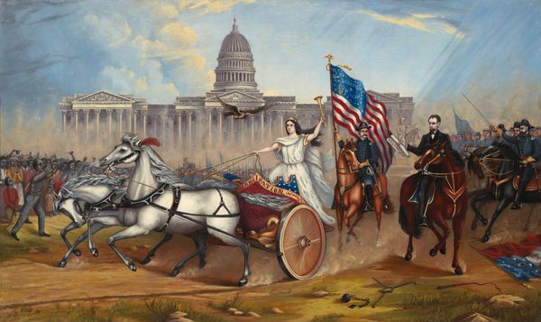
This is Edward McKnight Kauffer's poster for American Airlines, and it’s all about clean, crisp geometry. Look how the building rises from the ground, with the dark blue base almost blending into the night sky. I love the way he's used light and shadow to give the capitol depth. The subtle gradations in color around the dome – how the white fades into the blue sky – it’s a nod to the classic techniques of illusion, but simplified. It’s this distillation of form, the way he flattens and abstracts architecture, that really gets me. There’s a similar sensibility in some of Stuart Davis’s work. Like Davis, Kauffer understood how to capture the dynamism of modern life with streamlined shapes and bold colors. This poster is not just an advertisement; it’s a slice of American optimism, rendered with a modernist eye. It invites us to dream, to travel, to see the world anew.
Comments
No comments
Be the first to comment and join the conversation on the ultimate creative platform.
