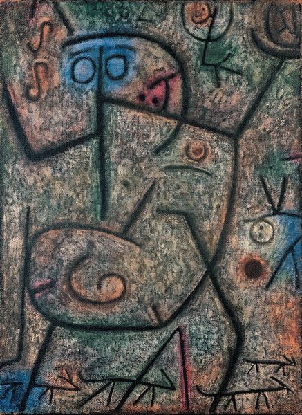
Dimensions: 44 x 46 cm
Copyright: Public domain
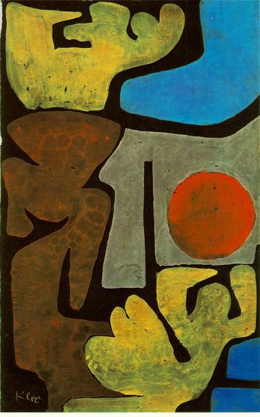
Editor: This is "Death and Fire," painted by Paul Klee in 1940, using tempera on paper. It's… intense. The crude, almost childlike figures contrast with the very weighty title. What strikes you when you look at it? Curator: The title and date are key. Painted on the cusp of unimaginable horrors during World War II, Klee isn’t just depicting death; he’s exploring the psychic and societal landscape of imminent destruction. It's expressionistic, but those symbolic stick figures—don't they feel like a critique of the detached nature of conflict, as though power is wielded by faceless entities? What about the color palette? Editor: Definitely, the reddish-brown background and the stark white of the face almost create this sense of unease, this almost…burning sensation, I think. Like something's being consumed, or is about to be. Curator: Exactly. Think about the cultural trauma experienced during that time, the collective fear, anxiety, and dehumanization. Klee, grappling with his own mortality, translates it into visual form. What’s interesting is how he refrains from being explicitly literal. Do you agree that there's an almost playful abstraction happening even with such a weighty topic? Editor: I do see the tension between something almost humorous in the simplicity of the figures and something deeply serious, like a warning. It feels very human, somehow. Curator: It humanizes the unnamable, brings those fears into dialogue. Art at its most politically resonant asks the hard questions, and sometimes, it screams without uttering a word. Editor: This really reframed how I view the piece. Seeing it as a reaction to such specific cultural context brings out a depth I initially missed. Curator: Exactly, understanding the 'why' of an artwork can bring layers of meaning that deepen our connection to the art.
Comments
No comments
Be the first to comment and join the conversation on the ultimate creative platform.
More like this