#
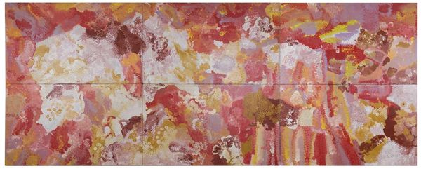
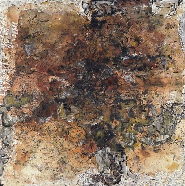
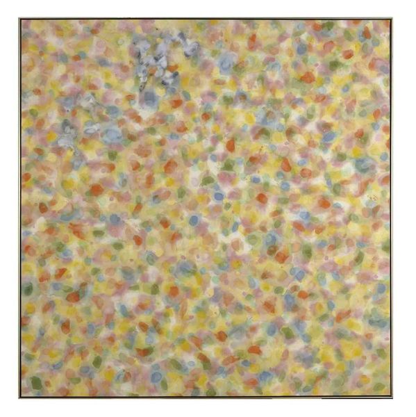
washington-colour-school
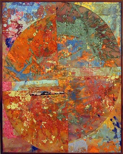
Copyright: Sam Gilliam,Fair Use
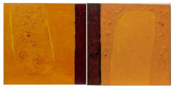
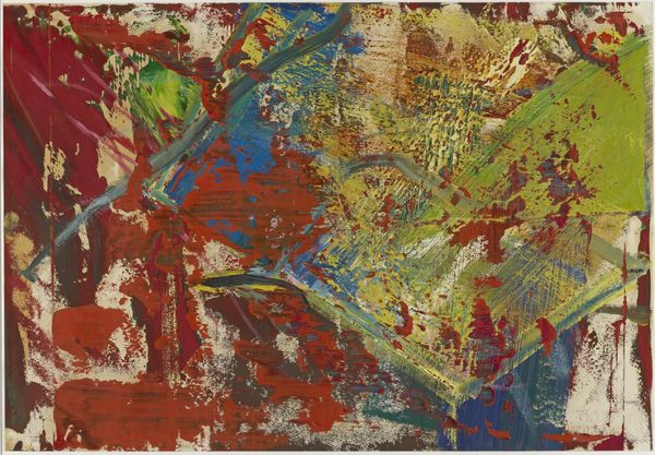
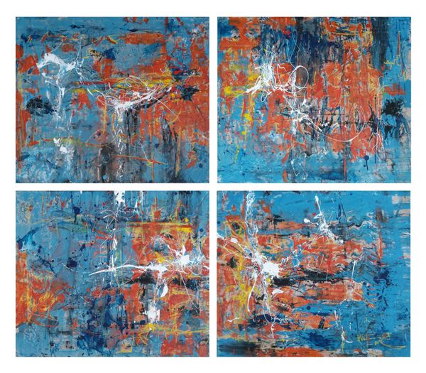
Sam Gilliam made "Toward a Red" with paint, and, it looks like, a whole lot of process. There is something deeply intuitive about the way he works with color. Look at the surface, that open expanse of orange and yellow. The paint isn’t brushed on so much as coaxed into being. Thin washes meet thicker, almost clotted areas. See the way the colors blend—or don’t? I love the little flecks of white, how they pop against the warmer tones, creating a sense of depth, almost like looking up into a cloudy sky. It’s not just about the colors themselves, but the way they’re applied—the gesture, the movement, the feeling. It reminds me a little of Helen Frankenthaler’s soak-stain paintings, but with a more assertive, almost muscular approach. What’s so amazing about this piece is that it doesn’t resolve into one single idea. It just keeps opening up, which is what good art should do.
Comments
No comments
Be the first to comment and join the conversation on the ultimate creative platform.
More like this