drawing, lithograph, print, graphite
#
portrait
#
pencil drawn
#
drawing
#
lithograph
# print
#
pencil drawing
#
romanticism
#
graphite
Dimensions: height 178 mm, width 120 mm
Copyright: Rijks Museum: Open Domain
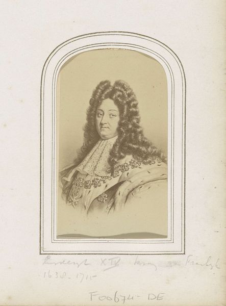
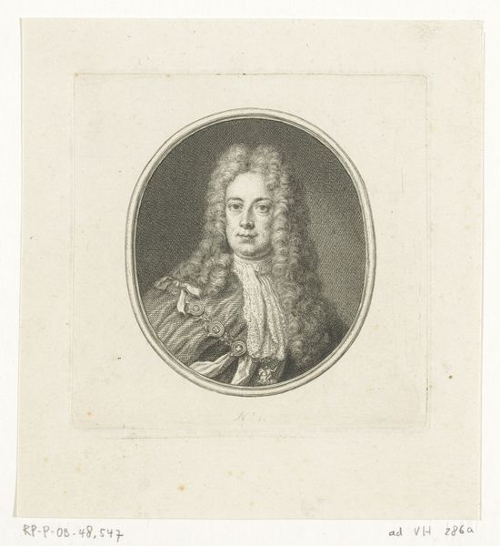
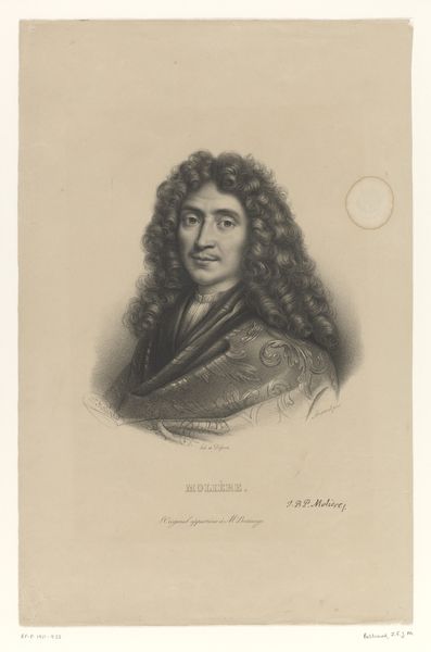
Editor: Here we have Zéphirin Belliard's "Portret van Louis de Rouvroy, hertog van Saint-Simon en Vermandois," created around 1829, it seems. It's a lithograph, based on a graphite drawing, quite delicate. What strikes me is how the starkness of the lines almost seem to isolate the subject, despite all that elaborate attire. How do you interpret this work? Curator: Consider the artist's formal manipulation of light and shadow, crucial elements within the print medium. The chiaroscuro effect – note how it models the face and wig – functions structurally to create volume and depth, even with such limited tonality. Also observe the composition. The bust is centered, yes, but note how the gaze directs us slightly to the left. What purpose do you think that serves? Editor: Perhaps it is just meant to lead our eye towards the inscription below, or a point in an imagined space beyond the portrait? It certainly avoids complete symmetry, adding a sense of dynamism to an otherwise still image. Curator: Precisely. This asymmetrical balance introduces a subtle tension. Semiotically, how does this deviate from traditional portraiture meant to convey power and stability? The delicate medium – lithograph – combined with this imbalance complicate straightforward interpretations of authority. Editor: That makes a lot of sense! I hadn’t considered how the medium itself could subvert the traditional reading of such a formal portrait. It makes you consider the "how" as much as the "who". Curator: Indeed, focusing on these intrinsic qualities reveals deeper complexities within the work. A rewarding observation.
Comments
No comments
Be the first to comment and join the conversation on the ultimate creative platform.
More like this