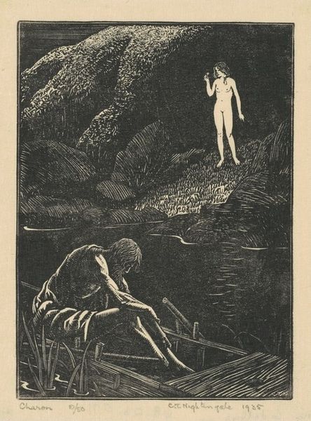
print, woodcut
#
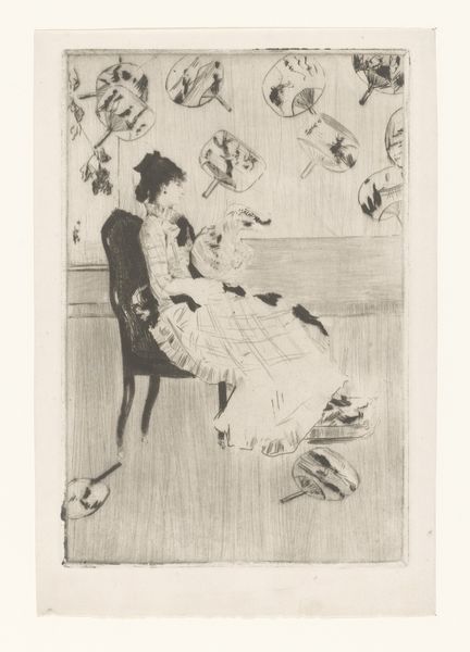
portrait
#
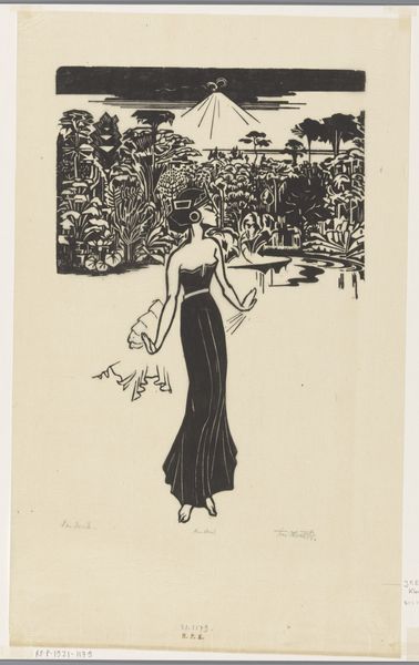
art-deco
#
pen drawing
# print
#
woodcut
#
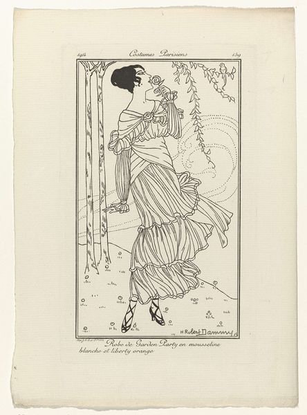
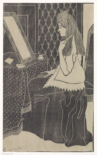
dress
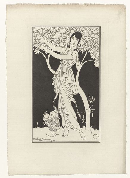
Dimensions: height 246 mm, width 190 mm
Copyright: Rijks Museum: Open Domain
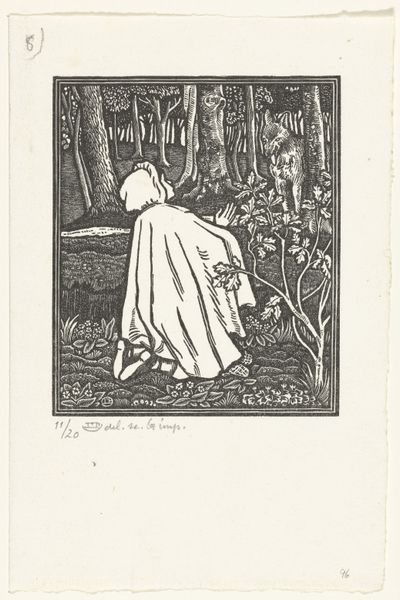
Fernand Siméon made this print, "Gazette du Bon Ton," around 1920. I love the way the solid blacks are offset by the negative space, it reminds us that artmaking is always a process of both addition and subtraction. Looking at the print, you get a real sense of the blocky, almost architectural quality of the linework, it's like he’s building the image up from chunks of material. Take a look at the leaves in the foreground, the way they’re rendered with these dense, almost uniform lines. There’s a real rhythm and weight to them, providing a solid base for the figures. It's not a fussy print, and that gives it a real confidence. I'm reminded of some of the German Expressionist printmakers, like Kirchner, who also embraced this kind of bold, graphic style. Like them, Siméon isn't trying to create a perfect illusion, but rather a feeling. The ambiguity is what makes it sing.
Comments
No comments
Be the first to comment and join the conversation on the ultimate creative platform.
More like this