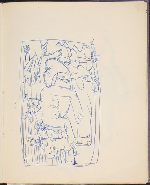
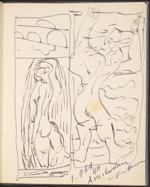
drawing, ink, pencil, pen
#
drawing
#
comic strip sketch
#
conceptual-art
#
narrative-art
#
pen sketch
#
old engraving style
#
figuration
#
personal sketchbook
#
ink
#
ink drawing experimentation
#
geometric
#
pen-ink sketch
#
pencil
#
abstraction
#
pen work
#
sketchbook drawing
#
pen
#
storyboard and sketchbook work
#
sketchbook art
Dimensions: book: 35.56 × 27.94 × 1.27 cm (14 × 11 × 1/2 in.) sheet: 35.56 × 27.94 cm (14 × 11 in.)
Copyright: National Gallery of Art: CC0 1.0
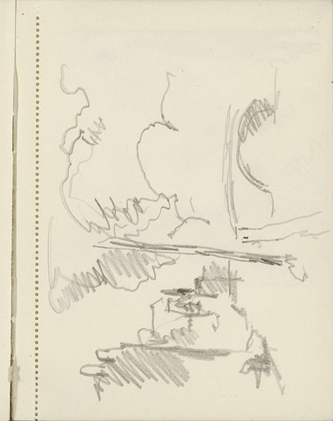
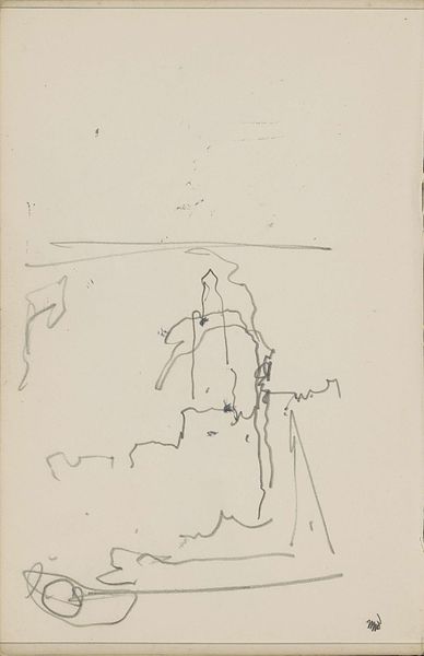
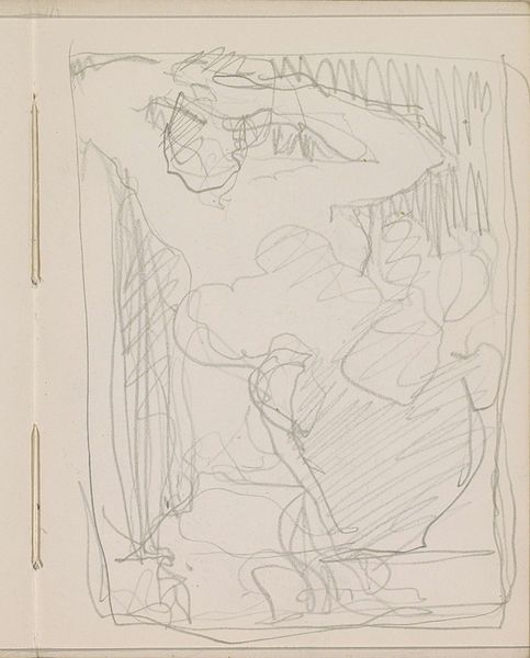
Curator: Saul Steinberg's drawing, likely from the 1980s and titled "Success and Failure," immediately strikes me as a melancholic jest. Editor: The rawness of the ink and pencil lines on what looks like a page torn straight from a sketchbook, give it a poignant handmade quality, really highlighting the work's accessible material vulnerability. Curator: Precisely. The composition directs us to two figures. Above, the summit is reached by "Failure" seemingly triumphant despite their label. Conversely, in the lower quadrant, "Success" reclines in a posture of indolence or perhaps exhaustion, beside a wilted tree. Editor: That's an intriguing take. Looking at it through the lens of production, it is striking how minimal the means are: pen, pencil, paper. Steinberg transforms the modest everyday materiality of office supplies into potent symbols of human condition and social commentary. This deliberate, yet modest, methodology almost amplifies the drawing's conceptual weight. Curator: A fruitful observation. The lines are decidedly unrefined, sketch-like in their application—not belabored in any way. Consider how this impacts the signification of the imagery. Does this contribute to a discourse around semiotic formalism? Editor: I wonder about that designation. If the image relies solely on those inscribed words—success, failure—as labels, wouldn’t that reduce its interpretive potential? Curator: Not if we recognize them as visual signifiers themselves! Look at the overall design— the dynamic diagonal of the mountain is countered by the still horizontal line upon which "Success" languishes. The relationship produces a reading experience through pure form. Editor: Fair enough. But shouldn’t we ask: What type of labor is celebrated and dismissed here? The drawing seems to engage in an interesting dichotomy by placing active and inactive labor into an uneasy exchange... Curator: Well, there’s also something elemental about this dualistic presentation that moves beyond easy critique. To what degree does "Success" signify more than simply inertia? The beauty here resides, perhaps, not in what it answers about this cultural fixation, but in what it asks through the economy of its form. Editor: True enough. "Success and Failure" manages to compress a grand narrative into an extremely portable package of combined and rather cheap materials. Quite potent, in the end. Curator: Yes, indeed, quite a compelling little gesture overall.
Comments
No comments
Be the first to comment and join the conversation on the ultimate creative platform.
More like this