Copyright: CC0 1.0
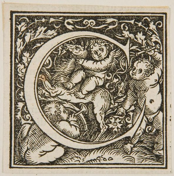
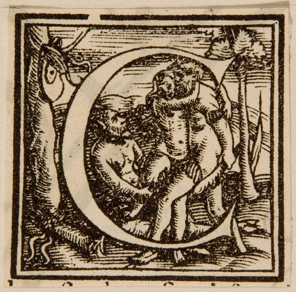
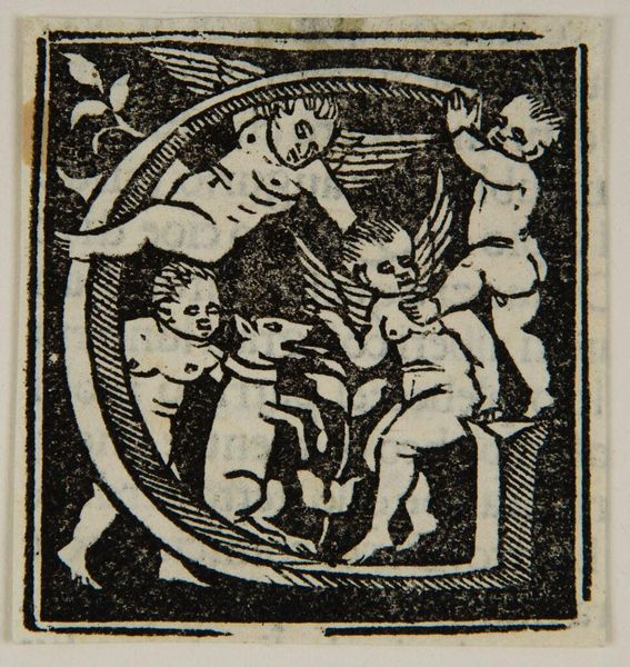
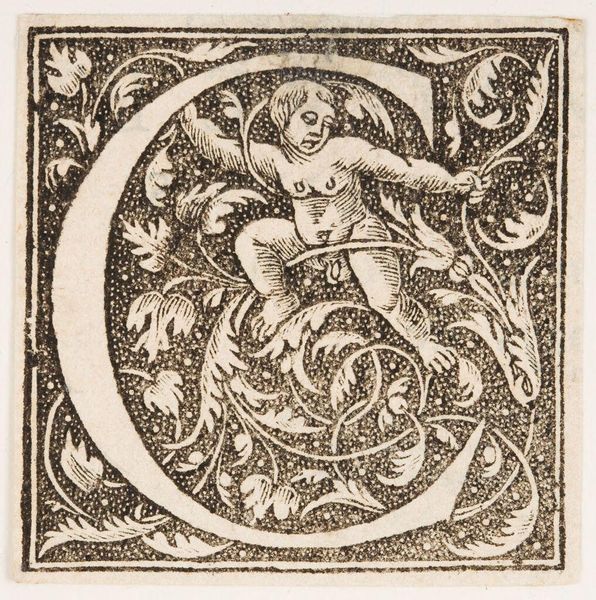
Editor: Here we have an initial "C," simply titled "Letter C," author unknown. I'm struck by how the floral design integrates with the letterform and the figures. What do you make of its composition? Curator: Note how the artist uses the black and white contrast to define the figures and foliage, creating a dynamic tension. The serifs of the letter “C” are mimicked by the curves of the plants. Do you see how the cherubic figures are positioned to echo the curve of the letter? Editor: Yes, the mirrored curves create harmony, but do you think the limited shading flattens the image? Curator: Perhaps, but that flatness emphasizes the surface and design, directing our focus to the interplay of forms rather than illusionistic depth. It highlights the objecthood of the print itself. Editor: I never thought of it that way, focusing on the surface. Thanks for pointing that out!
Comments
No comments
Be the first to comment and join the conversation on the ultimate creative platform.
