drawing, paper, ink
#
portrait
#
drawing
#
paper
#
ink
#
calligraphy
Copyright: Rijks Museum: Open Domain
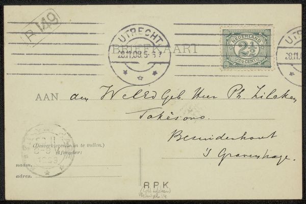
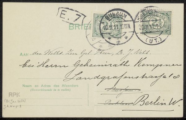
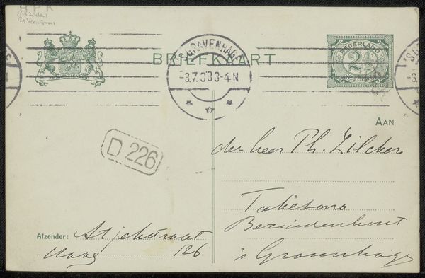
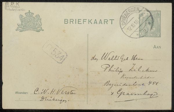
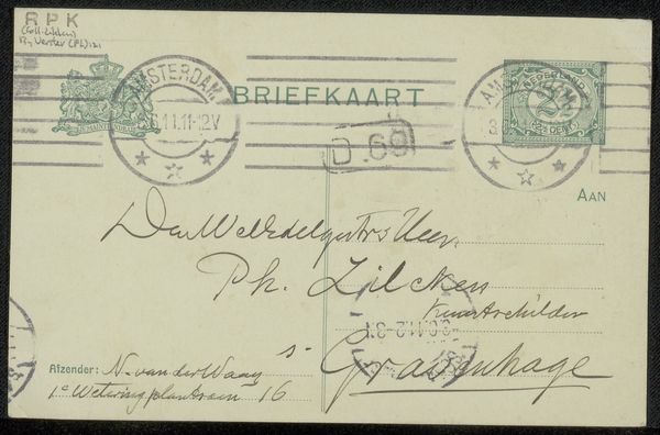
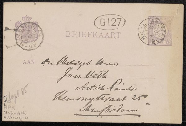
This is a Briefkaart, a postcard, made by Sientje Mesdag-van Houten, likely sent sometime in the late 19th century. The handwriting sprawls across the card in dark ink. Look at the "K" in "Kunstschelder." It's got this funny little loop, like the ink momentarily snagged on the paper. The lines are confident, sure, but there's also this quirky imperfection that makes it feel so alive, so human. You get the sense of someone quickly jotting down a note, not fussing over every detail. The surface is probably smooth, the kind of cheap paper they used for postcards back then. I imagine the ink soaking right in, leaving a slightly raised texture. The overall effect is modest and unpretentious. It feels like a quiet conversation, like peering into a tiny window to the past. It reminds me a little of Morandi, how he could find so much beauty and depth in the simplest of subjects. It's that attention to the everyday, to the quiet moments, that really resonates. It's a reminder that art isn't always about grand gestures or sweeping statements. Sometimes, it's about the small, intimate details that make life worth living.
Comments
No comments
Be the first to comment and join the conversation on the ultimate creative platform.
More like this