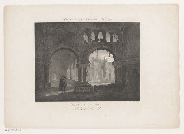
drawing, print, paper, ink, pencil, engraving
drawing
neoclassicism
ink paper printed
pencil sketch
landscape
paper
ink
pencil
academic-art
engraving
realism
Dimensions: height 273 mm, width 364 mm
Copyright: Rijks Museum: Open Domain
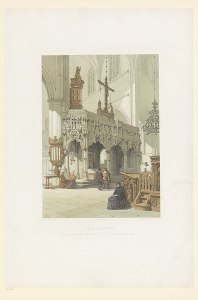
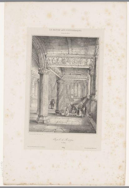
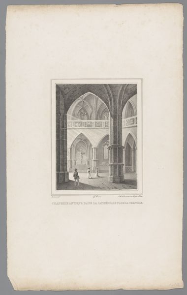
Editor: So, this is Guillaume Van der Hecht's "Graftombes van Karel de Stoute en Maria van Bourgondië," created sometime in the 1820s or 30s. It’s a print made using ink, pencil, and engraving. I’m struck by the contrasting textures—the smoothness of the arches against the ornate detail of the tombs. What are your initial thoughts on its formal qualities? Curator: The graphic contrast, most notably between the dark ink of the architectural details and the light of the paper, creates a tension that draws the eye. Observe how the linear perspective guides our vision into the receding space. Consider the placement of the figures – are they meant as scale reference, or do they offer some narrative, activating the space within the picture plane? Editor: That's interesting. I was mainly looking at the tombs themselves! The light from the windows really emphasizes their decoration, doesn't it? All those swirling patterns… what could that signify in terms of artistic conventions? Curator: Indeed, observe the contrast between the geometric regularity of the architecture and the curvilinear forms of the sculptural ornamentation. What affect does it produce? Do these ornate patterns compete with or complement the overall architectural composition? The contrast could emphasize a reverence towards that which the tombs represent. Consider, too, how the artist deployed line to model volume. Editor: I see what you mean. The linework creates a sort of dialogue between simplicity and complexity. Looking closely, you almost don't notice how bare the walls are around the tombs in contrast. Thank you for pointing that out. I wouldn’t have considered it at first glance. Curator: By isolating key formal components, and understanding how line, form, and space are employed, we arrive at a richer and more meaningful engagement with the print.
Comments
No comments
Be the first to comment and join the conversation on the ultimate creative platform.