#
neo-pop
Copyright: Modern Artists: Artvee
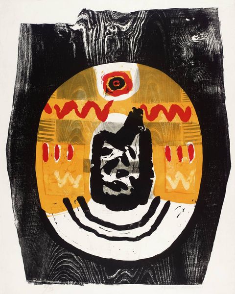
Keith Haring made Red-Yellow-Blue #2 with paint, though the exact date is unknown. There’s something immediate about Haring’s marks, like he was just grabbing and going for it, without the fuss of too much prep or planning. The palette is so basic, right? Just those primaries, and a black ground that’s not really flat but has all these circular scrawls underneath the image, like it was applied quickly, maybe with a rag. The thing that gets me is the way Haring contrasts the flat, bold colors with those more textured areas. Take the right eye, for example; it's all bright yellow, but then you notice the little circles of red inside, and it makes the eye pop. It gives the whole image this nervous energy, like it's vibrating. It’s this back and forth between control and looseness that feels so alive. I'm reminded a little of Miro and his playfulness with form and color, but Haring’s got this urban edge, this raw energy that’s all his own. It's art that's not afraid to be messy, not afraid to be real.
Comments
No comments
Be the first to comment and join the conversation on the ultimate creative platform.
More like this