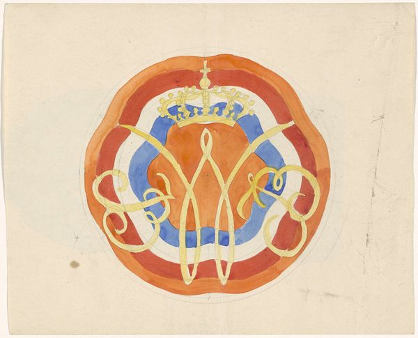
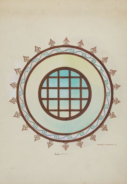
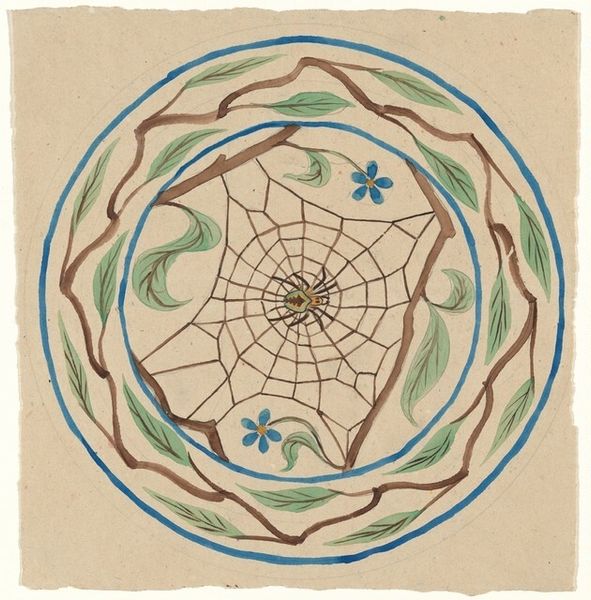
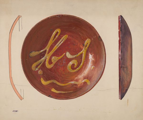
3-D Study for circular box with grid and dotted wavy border in blue, red and green 1948
0:00
0:00
graphic-art
#
graphic-art
#
geometric
#
abstraction
#
modernism
Copyright: Public Domain: Artvee
Curator: Looking at Winold Reiss's "3-D Study for circular box with grid and dotted wavy border in blue, red and green" from 1948, I’m immediately struck by its playful geometry. It's just brimming with potential energy, isn't it? Editor: Absolutely! It feels like a candy box design dreamed up by a modernist architect. The circles and grids, the contrasting colors...it's all hinting at something both ordered and whimsical. The dotted lines remind me of ancient borders on Greek pottery, hinting at contained narratives or protective symbolism. Curator: Exactly. I wonder what inspired him, perhaps even a specific product he intended this design for. Those repeating wave forms do evoke borders but in a mid-century vernacular, maybe hinting at a nautical theme for something meant to contain sweets or trinkets from faraway lands. Editor: Interesting. These bright, primary colors trigger such visceral reactions. Blue, red, yellow...they’re so archetypal. They speak to a kind of visual vocabulary that crosses cultural lines and developmental stages in childhood. The grid in the middle, intersected by dotted patterns, could suggest a balance between structured space and chaotic information. Curator: Well, the use of geometric abstraction typical of Modernism certainly resonates, reducing forms to essentials and giving new importance to simple shapes. Editor: Yes! And I read the juxtaposition of the hard grid with the undulating wave border almost like a visual representation of tension: control versus chaos. Or maybe stability and movement. It’s very satisfying on some subconscious level. It's curious to consider if it would be considered as appealing if those design patterns were to follow, say, a zig-zag form? Curator: Interesting question. Changing that wave pattern would undeniably alter its feel, wouldn't it? The current design leans into fluid, organic movement while retaining a structural clarity that grounds the design... it's dynamic yet reassuring! This seemingly straightforward study reveals a fascinating exploration into visual balance. Editor: Precisely. This exploration through form, color and pattern creates its evocative aura. Curator: An insightful peek into Reiss’s process!
Comments
No comments
Be the first to comment and join the conversation on the ultimate creative platform.
More like this