#
aged paper
#
toned paper
#
homemade paper
# print
#
personal sketchbook
#
ink colored
#
sketchbook drawing
#
watercolour bleed
#
watercolour illustration
#
sketchbook art
#
watercolor
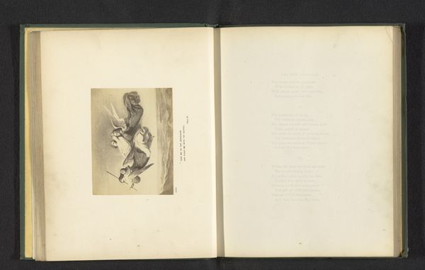
Dimensions: height 109 mm, width 76 mm
Copyright: Rijks Museum: Open Domain
Editor: Here we have "Two Birds on a Flowering Branch," by Albert Frisch, likely before 1890. It looks like watercolor and tempera. It's a simple composition but quite charming. The colours are soft, muted even. How do you interpret this work, focusing on its form? Curator: The piece is interesting in its arrangement of forms, which seem to strive toward, and accomplish, balance through asymmetry. Note the deliberate placement of the birds relative to the blossoming branch. Consider how the lightness of the paper surrounding the image isolates and highlights its components: line, colour, and shape. Editor: So, it’s the visual relationships, not necessarily the subject matter that are key here? Curator: Precisely. Observe the economy of line in depicting the birds' feathers. The artist uses very few strokes, yet captures their essence. Also, note how the artist limits the palette—the interplay between the blues and pinks and earth tones is very deliberate. Does it evoke a particular feeling for you? Editor: A sense of peacefulness, I suppose. A kind of quiet observation of nature. It also feels a bit like Japanese prints... Curator: An excellent point! One sees a clear understanding and application of Japanese printmaking techniques in the emphasis on flattened space and stylized natural forms. By isolating specific aspects of Japanese design, such as careful color selection, Frisch masterfully transforms a standard landscape genre. The overall effect is rather clever in how it borrows from a different visual culture. Editor: I hadn't really thought about how much is being conveyed through such limited color and line. I see so much more to consider in how everything is constructed! Curator: Indeed, and the paper it's printed on has a crucial function here too; its color and slight imperfections act as an essential field of visual effect.
Comments
No comments
Be the first to comment and join the conversation on the ultimate creative platform.
More like this