drawing, mixed-media, paper, watercolor
drawing
mixed-media
paper
abstract
form
watercolor
expressionism
geometric-abstraction
abstraction
line
cityscape
modernism
Copyright: Public Domain: Artvee
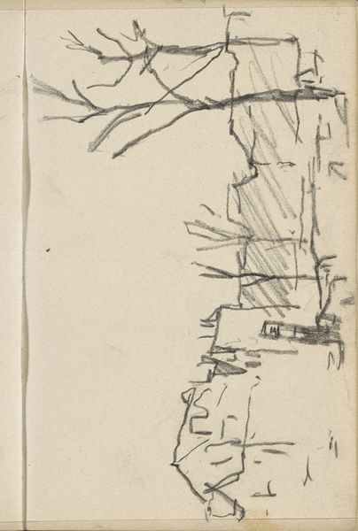
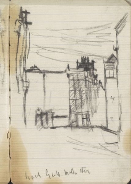
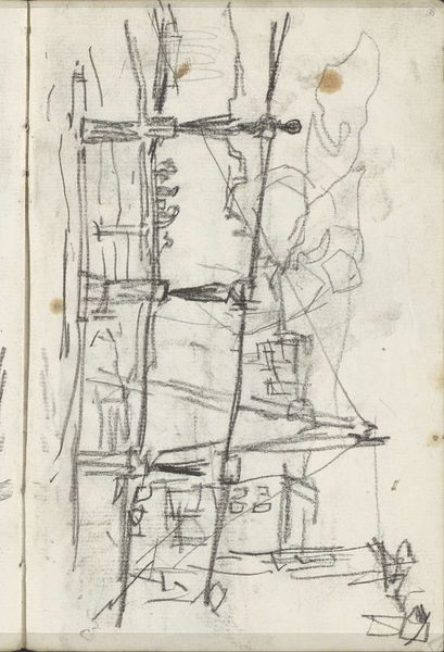
Karl Wiener made this watercolor and ink drawing sometime before 1949; the title translates as 'Construction in Violet and Red'. It's wild to see how the colours play off each other, right? Like, the yellow is really vibrating against the violet and red, so that the architecture starts to feel alive, unstable. Look at the little hatched marks in black ink that make up part of the architectural structure. They are so deliberate, almost obsessive, giving the piece a sense of depth and texture that contrasts with the flat washes of colour. There's something about the handmade quality, those tiny repetitive lines, that brings me closer to the artist and the making of this work. This piece reminds me of Lyonel Feininger's architectural fantasies – all angular lines and translucent planes of colour. Maybe it's the utopian promise of modernism, or the way we can build up our own ways of seeing the world, one colour, one line at a time.
Comments
No comments
Be the first to comment and join the conversation on the ultimate creative platform.