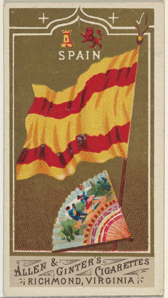
Scotland, from Flags of All Nations, Series 1 (N9) for Allen & Ginter Cigarettes Brands 1887
0:00
0:00
drawing, print
#
drawing
# print
#
naive art
#
watercolor
Dimensions: Sheet: 2 3/4 x 1 1/2 in. (7 x 3.8 cm)
Copyright: Public Domain
Curator: This watercolor and print piece, created around 1887, is titled "Scotland, from Flags of All Nations, Series 1 (N9)" by Allen & Ginter Cigarettes Brands. Editor: My first impression is quite charming; the colors, despite their apparent vibrancy, offer a soft and gentle presentation. It's naive in style, perhaps intentionally so. Curator: Yes, these were originally inserts in cigarette packs! Consider what this represents—imperialist trade and global outreach by a brand utilizing iconography to reach varied markets and imbue their products with notions of heritage and authenticity. Scotland is rendered as both beautiful and passively consumable. Editor: I am especially intrigued by the flatness. It lends itself beautifully to the simplified shapes. Notice how the Scottish thistle, emblem of the nation, is rendered; each component, down to the very spikes, receives equivalent consideration. The textures invite touch, and even a material longing. Curator: Right, and let’s remember the historical context: the late 19th century saw the height of British imperial expansion. Marketing became increasingly entwined with projecting national identity and valorizing exploration and trade. Cigarette cards were one medium of communicating these values. Editor: What resonates most is how it achieves depth through layering: we see flag, flowers and plaid patterns presented on different planes, so we have some spatial awareness even if realism isn't a concern. Curator: Certainly, it prompts questions about cultural commodification and the packaging of national identity. To what extent does representing Scotland on a cigarette card trivialize or perhaps, in a perverse way, amplify its symbolic significance? What would Scottish people think seeing this little representation being sold with each cigarette pack? Editor: Yes, there is an intrinsic flattening and fetishization of “Scottishness” at play. However, the design is also rather fetching when assessed on pure compositional terms; there's a formal elegance even if it’s an applied, mass-produced piece. Curator: A reminder that these commercial artworks were both a product of and contributors to complex political and cultural dynamics. It reveals the intertwined relationship of nation, identity, and capital at the time. Editor: I concur! It also speaks volumes about the potential to find the aesthetic value even in functional pieces or mass marketing materials. It makes you rethink the idea of "art" a little bit, doesn’t it?
Comments
No comments
Be the first to comment and join the conversation on the ultimate creative platform.
More like this