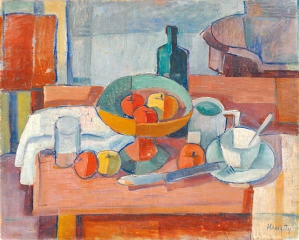
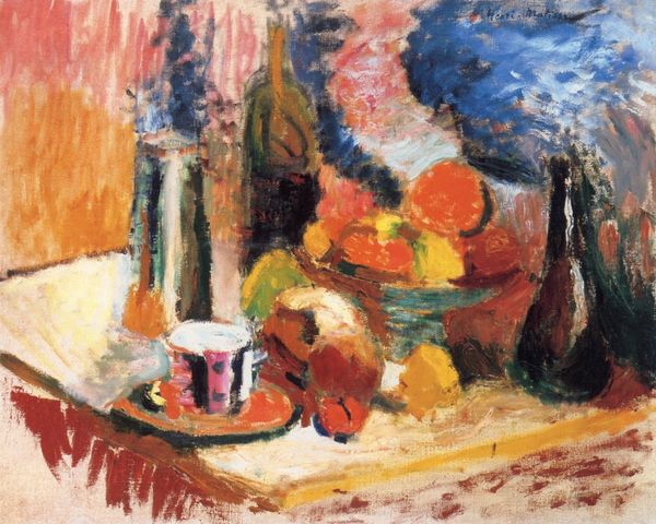
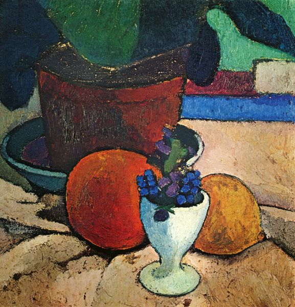
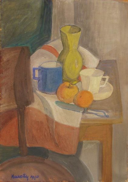
Still Life with Oranges II 1899
0:00
0:00
henrimatisse
Washington University Gallery of Art (WUSTL), St. Louis, MO, US
Dimensions: 46.7 x 55.2 cm
Copyright: Public domain US
Editor: Here we have Matisse's "Still Life with Oranges II," painted in 1899. It’s an oil painting, full of these almost clashing colors. The blues against the oranges, the bold lines... I’m struck by how energetic and, dare I say, slightly chaotic it feels for a still life. What grabs your attention when you look at it? Curator: It’s a painting that vibrates, doesn't it? For me, it's the almost reckless joy in the color that speaks loudest. It’s like Matisse is saying, "To hell with realistic representation; I'm going to capture the essence of light and form." Do you see how he almost throws down the paint, especially in that tablecloth? It's pure expression! This painting to me feels almost like a shout of optimism right before Fauvism really took hold. Editor: Absolutely, that tablecloth feels almost unfinished, but it adds to the charm. You mentioned capturing light. How do you think he achieves that sense of luminosity, especially with such bold hues? Curator: Well, think about it—complementary colors make each other 'pop'. Blue and orange, green and a softer red…it is about how the colours work together to reflect a whole story about seeing, tasting. Each brushstroke dances with its neighbour! If one listens hard, the painting can begin singing and perhaps offer one a slice… It reminds me of my grandmother's marmalade! Editor: So, it’s not just about what he paints but how he makes those elements communicate? Curator: Precisely. It is the same joy I get when my two mischievous cats chase each other. Complete mayhem that always finds some type of artistic resolve, right? Editor: That makes so much sense! I guess I always looked at still lifes as static things, but you've helped me see the energy and emotion that can be captured within. Curator: Glad to assist in opening a window, I am! One should find still lives everywhere if they learn to see like Henri.
Comments
No comments
Be the first to comment and join the conversation on the ultimate creative platform.
More like this