drawing, print, etching, engraving
drawing
narrative-art
etching
caricature
figuration
romanticism
engraving
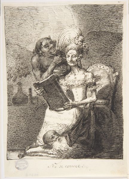
Dimensions: 6-15/16 x 4-15/16 in. (17.6 x 12.5 cm)
Copyright: Public Domain
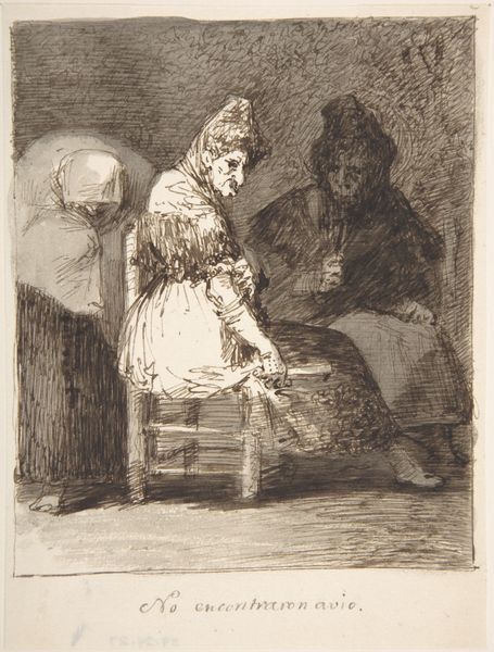
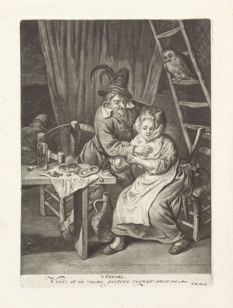
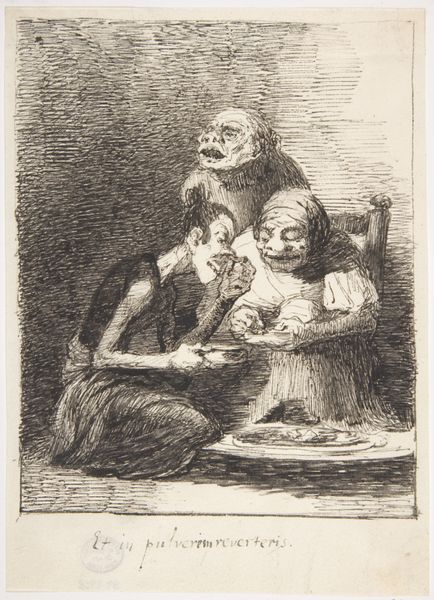
Editor: Here we have Leonardo Alenza's "The Pampered Idiot", made sometime between 1807 and 1845, using etching, engraving, and drawing. It's… striking, in a disturbing way. There's so much visual tension created by the contrasting characters and exaggerated features. How do you interpret this work? Curator: Indeed, it is unsettling. From a formal perspective, note the strategic deployment of line and shadow. Alenza uses cross-hatching to build depth and texture, particularly evident in the figures' clothing. This meticulous detail emphasizes their physical presence, underscoring the grotesque nature of the central figure. Observe the compositional triangle formed by the three figures; how does it affect the viewer’s eye? Editor: It traps the eye. I keep going back to that central figure, the so-called "idiot". The lines are almost violently etched, highlighting its exaggerated features, whereas the others are softer, somehow… resigned. Curator: Precisely. The sharp contrast contributes to the overall disquiet. The artist uses light not to beautify, but to amplify the satirical effect. The subdued light further isolates the figures and creates an ominous atmosphere, almost claustrophobic. Editor: So, the aesthetic choices amplify the social commentary? Curator: The medium—printmaking—allows for dissemination. Its roughness mirrors the vulgarity that is critiqued. Each deliberate choice, line, shadow, composition contributes to a cohesive statement about the decay of virtue, or perhaps a lament over societal ignorance. Do you find any aspect formally contradictory or unresolved? Editor: Not really. I think that, now that you mention it, the roughness emphasizes the message. It's almost meant to be unpleasant. Curator: Precisely! This work, with its technical choices, resonates across time, encouraging us to interrogate power, perception, and the societal structures that shape both. Editor: Seeing how all the details connect creates a much richer understanding of this artwork, beyond just the initial shock of its image.
Comments
No comments
Be the first to comment and join the conversation on the ultimate creative platform.