print, woodcut, engraving
# print
#
figuration
#
woodcut
#
pen work
#
history-painting
#
northern-renaissance
#
engraving
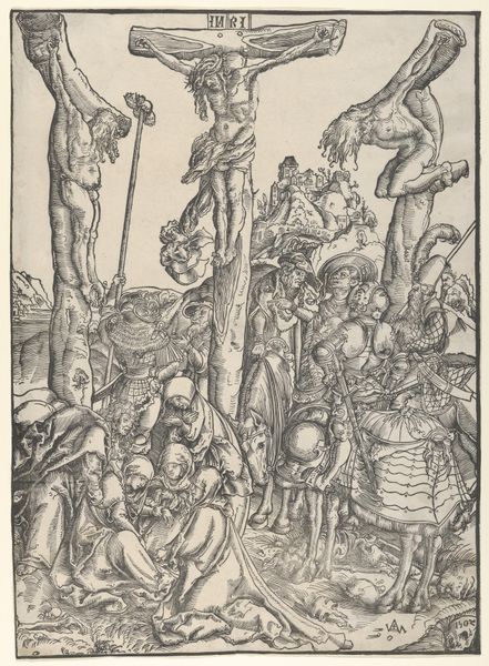
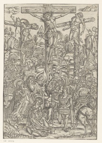
Dimensions: 407 mm (height) x 298 mm (width) (bladmaal)
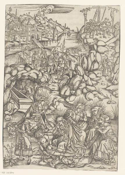
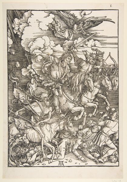
Editor: Here we have Albrecht Dürer’s "The Crucifixion," created sometime between 1496 and 1499. It's a woodcut print, and what immediately strikes me is how incredibly detailed and, well, a little gothic it feels, especially considering the Renaissance was in full swing. There's so much going on. What do you see in this piece that maybe I'm missing? Curator: Ah, Dürer! Always a fascinating character. You know, what I see here is Dürer wrestling with tradition and innovation, like a culinary artist throwing parmesan on sushi to start new trends. This woodcut isn't just a religious scene, but a potent blend of Northern European emotional intensity with Renaissance compositional ideas. Have you noticed how he uses the dense, almost chaotic, composition to evoke a feeling of overwhelming grief and spiritual turmoil? It’s theatrical! Almost operatic. Editor: Operatic, yes, I see that! All those figures, each with such distinct expressions. But isn't that busyness distracting? It almost detracts from the central figure of Christ. Curator: Perhaps, but maybe that's precisely Dürer's point. The crucifixion wasn't a solitary event; it was a public spectacle filled with a cacophony of emotions: faith, despair, cruelty. I think Dürer wants us to feel that complexity, even if it feels overwhelming. Plus, those details…they draw you in, don't they? Like a good mystery novel that demands to be read, despite the looming weight of its plot, to catch every nuanced detail that’s been woven into its overarching story. Editor: That's a compelling point. So it’s not a flaw, but a deliberate choice to reflect the chaotic reality of the event. Thanks, I think I understand the intent better now. Curator: My pleasure. Art is often just a conversation we’re having with ourselves anyway, hopefully through some fascinating conduit to the collective cultural conversation.
Comments
No comments
Be the first to comment and join the conversation on the ultimate creative platform.
More like this