Copyright: Modern Artists: Artvee
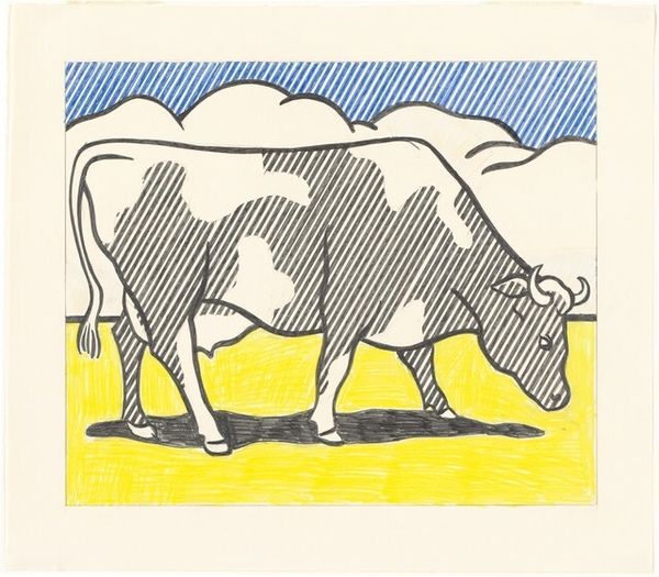
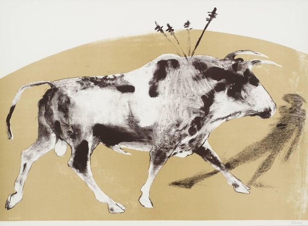
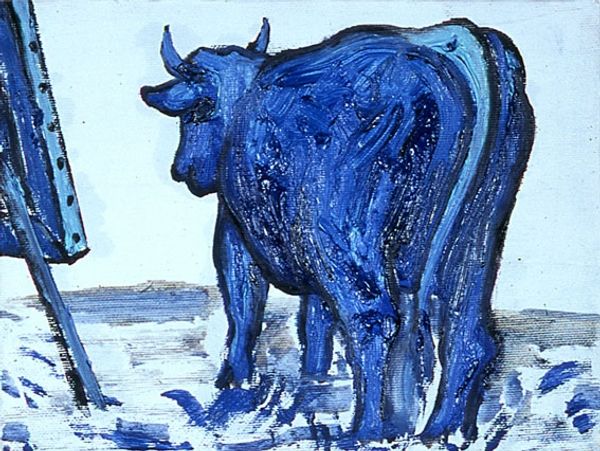
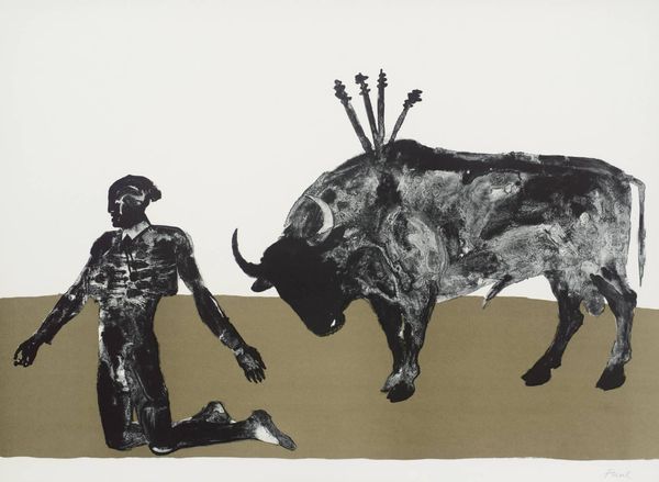
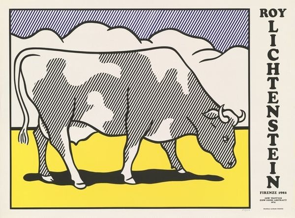
Roy Lichtenstein made this screenprint, "Bull II," using flat, unmodulated colors and bold outlines that flatten the image. It’s all about process. The bull progresses from representation to nearly pure abstraction. The blue, that vivid, almost electric blue, grabs you first. It’s a colour he used a lot, think ‘Ben Day dots’, but here it's solid, anchoring the composition. It fills the bulk of the animal, simplifying its form into distinct shapes. Look how the black outlines delineate the bull’s body, turning it into a graphic emblem, a sign, or a symbol. Lichtenstein, he's always in conversation with the history of art, but he does it in his own way. The simplified form reminds me of Picasso’s bull lithographs, but it is so different. Where Picasso used line and form to reveal the essence of the animal, Lichtenstein flattens it out, making it pop, giving it this very contemporary, comic-book kind of edge.
Comments
No comments
Be the first to comment and join the conversation on the ultimate creative platform.
More like this