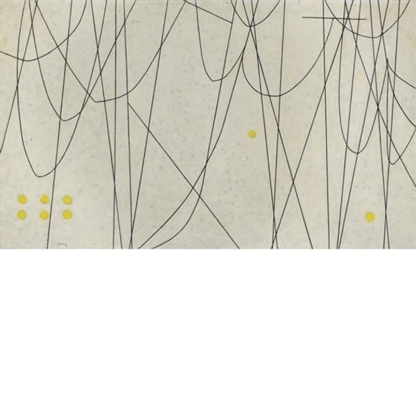
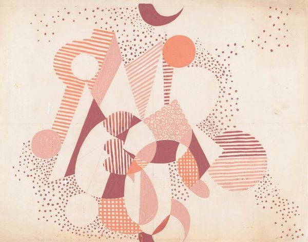
![Design on Title Page [left half] by Jacques Villon](/_next/image?url=https%3A%2F%2Fd2w8kbdekdi1gv.cloudfront.net%2FeyJidWNrZXQiOiAiYXJ0ZXJhLWltYWdlcy1idWNrZXQiLCAia2V5IjogImFydHdvcmtzLzdlY2I5NGIxLTBhMjAtNDY1My1hMTcxLTUyNzZlZjM2YzcxOS83ZWNiOTRiMS0wYTIwLTQ2NTMtYTE3MS01Mjc2ZWYzNmM3MTlfZnVsbC5qcGciLCAiZWRpdHMiOiB7InJlc2l6ZSI6IHsid2lkdGgiOiAxOTIwLCAiaGVpZ2h0IjogMTkyMCwgImZpdCI6ICJpbnNpZGUifX19&w=1920&q=75)
drawing, mixed-media, print, pencil, graphite
#
abstract-expressionism
#
drawing
#
mixed-media
#
light pencil work
#
blue ink drawing
# print
#
personal sketchbook
#
geometric
#
pencil
#
abstraction
#
graphite
#
sketchbook drawing
#
sketchbook art
Copyright: National Gallery of Art: CC0 1.0
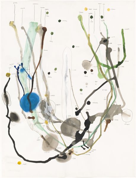
Editor: Here we have Jacques Villon’s "Design on Title Page [left half]", a mixed-media drawing and print from 1955. It reminds me of a colorful constellation chart against a shadowy burst. How would you interpret this work? Curator: The beauty of this piece resides within its formal construction. Note the interplay between the graphite lines and the carefully placed colored dots. It creates a tension between precision and spontaneity. Consider how the artist balances the textural contrast of the pencil shading with the smooth uniformity of the colored circles. Do you perceive a relationship between the top and bottom groupings? Editor: They seem to mirror each other, with the colored dots becoming more vibrant towards the bottom. The shading is darker and more chaotic on top, almost like a fading memory of the brighter forms below. Curator: Precisely. The work establishes a fascinating dichotomy between chaos and order through color and mark-making. This is what lends the piece its visual energy. The orientation of the geometric forms also lends to the positive and negative space, generating a compositional tension that keeps the eye moving. Editor: So, you’re saying the pure visual relationships—the contrasts in texture and color, the balance between order and chaos—are key to understanding its power, rather than any external meaning? Curator: Yes, that is a reasonable interpretation, and it accounts for how the image feels dynamic, alive, and evocative despite its simple geometric elements and relative lack of objective, referential imagery. The picture embodies the principles of Abstract Expressionism, which emphasizes pure visual effect over representation. Editor: I see it now. It's like Villon is experimenting with the very building blocks of visual language, showing us how basic elements can create a complex and engaging experience. Thank you for illuminating this formal language for me! Curator: You're welcome!
Comments
No comments
Be the first to comment and join the conversation on the ultimate creative platform.
More like this