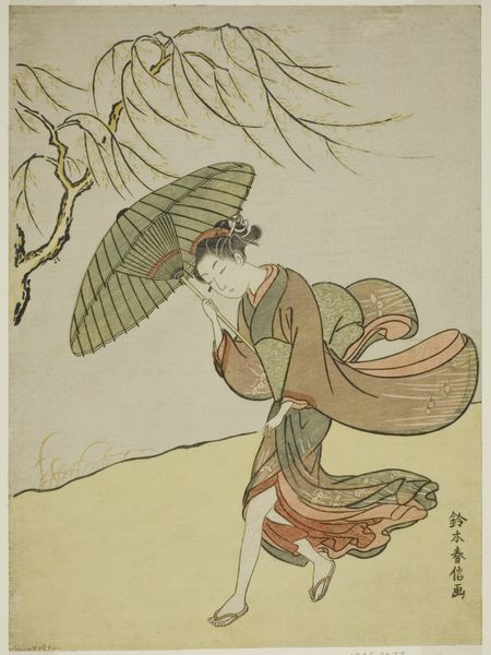
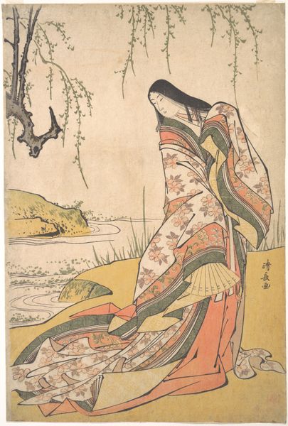
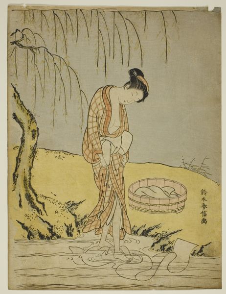
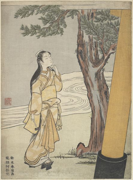
Visual Parody of the Calligrapher Ono no Tōfū (later edition) after 1765
0:00
0:00
print, ink
#
portrait
# print
#
landscape
#
ukiyo-e
#
japan
#
ink
Dimensions: 10 15/16 × 7 15/16 in. (27.8 × 20.1 cm) (image, sheet, vertical chūban)
Copyright: Public Domain
Editor: This is "Visual Parody of the Calligrapher Ono no Tōfū (later edition)," a print made after 1765 by Suzuki Harunobu. It’s done with ink, and what strikes me first is how delicate the lines are, particularly in the willow tree and the woman's kimono. What stands out to you? Curator: The composition’s effectiveness lies in its skillful arrangement of forms. Observe the delicate balance between the static verticality of the woman and the dynamic horizontality of the water and landscape. Note how the subtle curves of the umbrella and willow branches echo each other, creating a visual harmony. Editor: I see that now. The shapes do play off each other nicely. The eye is lead around, back and forth. Is there a hierarchy to these forms, would you say? Curator: Certainly. The woman's placement dominates the composition. It establishes a clear figure-ground relationship. Now, consider the role of line in defining form here. Note the distinct way it defines volume through contour and delicate tonal variation. How would you describe the negative space? Editor: It feels very active. Even the sky seems to participate in the narrative, despite its lack of explicit detail. The frog and birds enhance the sense of depth. Curator: Precisely. This tension and careful control over line are critical to its meaning and visual interest. The artist’s selection and distribution of graphic elements invites interpretation and offers aesthetic value. Editor: I appreciate your analysis, highlighting the emphasis on shapes and lines! Curator: Indeed. Thinking this way sharpens our perceptions. It's useful to understand an artist's intentions when considering their graphic skills and command of the chosen material.
Comments
No comments
Be the first to comment and join the conversation on the ultimate creative platform.
More like this