Copyright: CC0 1.0
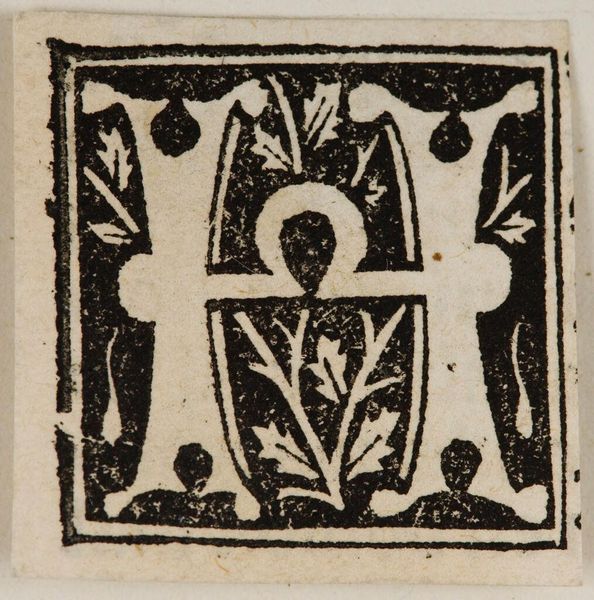
Curator: Here we have "Letter M," by an anonymous artist, housed here at the Harvard Art Museums. Editor: It's striking how this small tile commands attention with its stark monochrome palette. The material itself seems significant. Curator: Indeed. The balance of positive and negative space creates an interesting tension. Note the symmetrical arrangement of the floral motifs; there is a clear formalism at play. Editor: I wonder about the process here, though. Was it printed or hand-painted? The materials used—the pigment, the tile itself—speak to an artisan's labor and likely a specific social function. Curator: Regardless, the composition itself is quite elegant, even refined. The lines converge, the curves create an elaborate letter form. Editor: Perhaps. But appreciating how it was made, its humble origins, gives it a depth beyond mere decoration. Curator: A valid point. The interplay between form and function keeps us grounded. Editor: Precisely. It's the intersection of labor and design, isn't it?
Comments
No comments
Be the first to comment and join the conversation on the ultimate creative platform.
More like this