narrative-art
caricature
naive art
cityscape
watercolour illustration
modernism
Copyright: Public Domain: Artvee
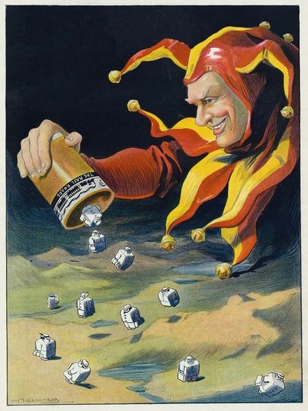
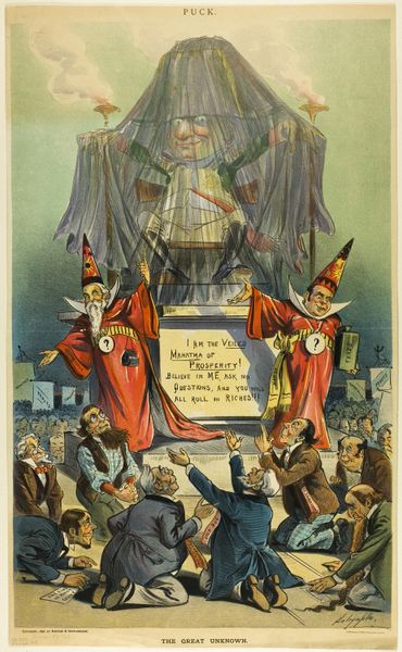
Editor: We’re looking at Louis Glackens’ "The Yellow Press" from 1910, made using print. The cartoonish quality, combined with the harsh messages printed on the newspapers, creates a very chaotic, almost nightmarish, feeling. What visual elements stand out to you? Curator: Let's examine the compositional structure. The eye is immediately drawn to the vibrant jester figure. Note the dynamic diagonal created by his pose, directing the viewer from the lower left to the upper right. How does the use of color reinforce this diagonal? Editor: Well, the yellow newspapers also fly upwards toward the right corner. Is this relevant? Curator: Precisely. Yellow acts as a motif, linking the machinery to the newsprint and, symbolically, to the chaos it generates amongst the people. Notice also the figures atop the press – detached, almost managerial in their indifference, further emphasizing the mechanization of information. How would you say this piece relates to Modernist styles? Editor: I can see the satirical edge and distortion of figures, which are typical for modernism. Does the overt symbolism detract from the artistic merit, in your opinion? Curator: Not at all. Semiotics thrive on clear symbolism. The artist has distilled a complex societal critique into an engaging visual form, a synthesis characteristic of great art, no? What’s more interesting is the lack of resolution or obvious visual cues for action. It implies complicity. Editor: I hadn't considered the passive roles within the piece. Seeing the colour, the composition, and the arrangement of the narrative as intentional design elements is helping me understand this in more depth. Curator: Indeed, analysing the relationships between these intrinsic qualities reveals the power and complexity of Glackens’ work.
Comments
No comments
Be the first to comment and join the conversation on the ultimate creative platform.