Copyright: Modern Artists: Artvee
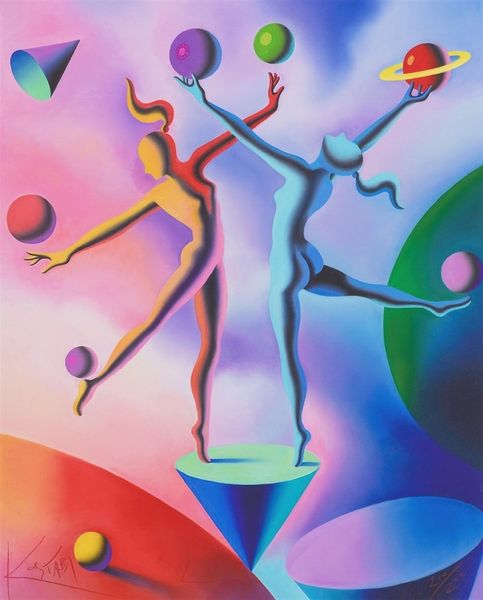
Mark Kostabi made this painting, Earth Inc., sometime around now with what looks like acrylic paint. The colors here are super deliberate, a limited palette, almost corporate, don’t you think? It’s flat, very smooth, no brushstrokes to be seen, and the figures are like simplified robots, each a different color but all with the same hard edges. Look at how those figures are arranged, almost like they're at a board meeting, reaching for a giant sun, or maybe even a lightbulb. The flatness of the painting, that smooth surface, it’s like the whole thing is a graphic, a commentary on modern life, stripped down to its basic shapes. Are they trying to grab the sun, own it, or maybe just trying to keep it from falling? It’s this kind of ambiguity that makes Kostabi’s work interesting, not giving you any easy answers. It reminds me a little of Giorgio de Chirico, that same feeling of being slightly off, a little lost in translation.
Comments
No comments
Be the first to comment and join the conversation on the ultimate creative platform.
More like this