drawing, print, paper, watercolor, pencil
#
drawing
# print
#
impressionism
#
landscape
#
paper
#
watercolor
#
coloured pencil
#
pencil
Copyright: Public Domain
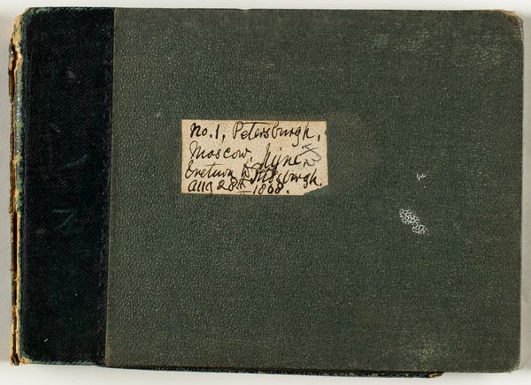
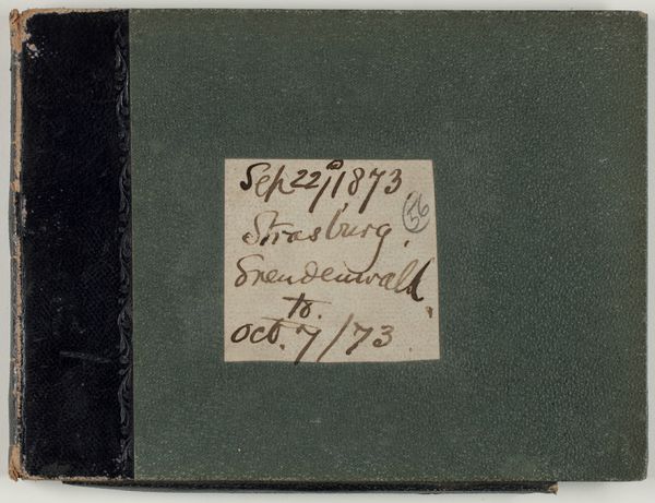
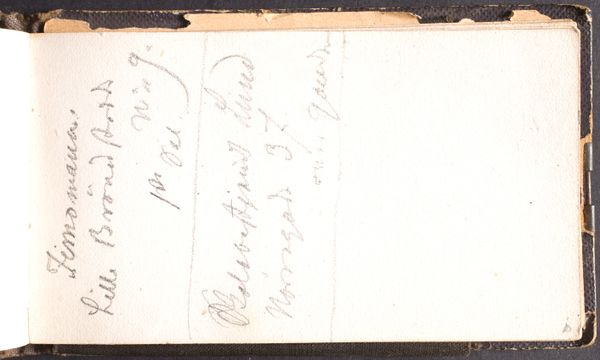
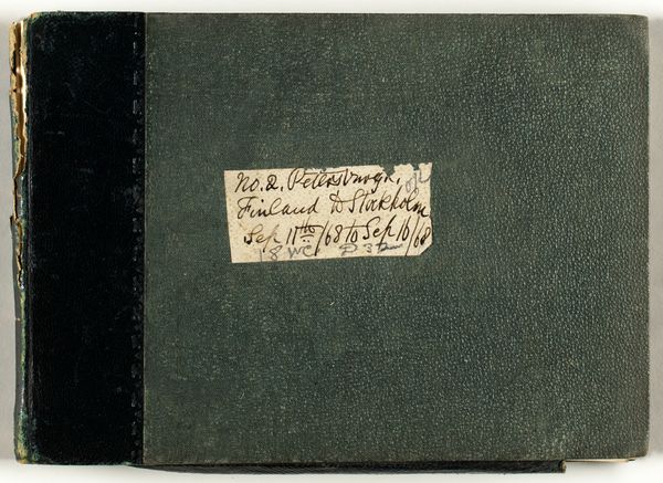
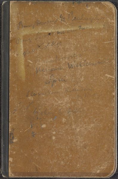
This artwork, Whitby to Scarboro, by Charles George Lewis, presents a fascinating study in contrasts, bound within the covers of what appears to be a sketchbook. The composition is stark: a dark, textured material on the left gives way to a smoother, pale green surface on the right, bisected by a handwritten label. The label itself, a rectangle of light paper, is densely filled with cursive script in dark ink. This interplay of textures, from the rough binding to the smooth paper and the delicate script, establishes a visual dialogue. The handwritten text disrupts the uniform background, drawing our attention to the contrast between organic form and structured space. The dates and place names, seemingly random, suggest a journey, a personal history recorded in fragments. The writing, with its looping lines and varied weights, introduces movement and rhythm to the otherwise static composition. Ultimately, the artwork’s power lies in its ability to function as both image and text, blurring the lines between visual and linguistic communication. The structure invites us to interpret the artwork as a sign. The juxtaposition suggests the complex layers of meaning we assign to objects and memories.
Comments
No comments
Be the first to comment and join the conversation on the ultimate creative platform.
More like this