drawing, paper, pencil, architecture
#
drawing
#
aged paper
#
hand written
#
incomplete sketchy
#
hand drawn type
#
paper
#
personal sketchbook
#
hand-written
#
hand-drawn typeface
#
fading type
#
sketch
#
pencil
#
sketchbook drawing
#
academic-art
#
sketchbook art
#
architecture
Copyright: Rijks Museum: Open Domain
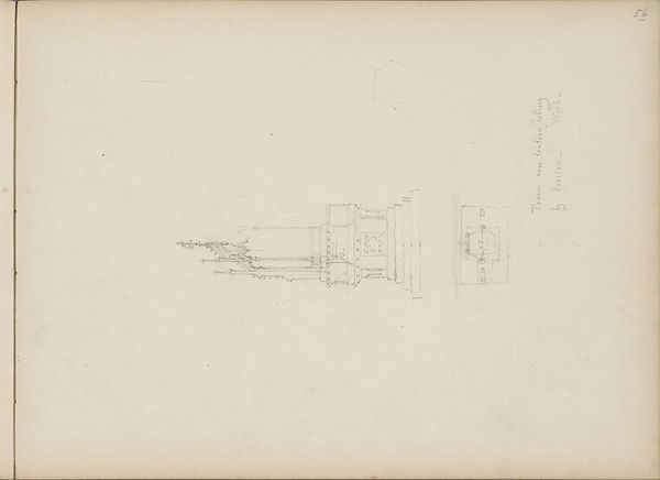
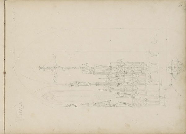
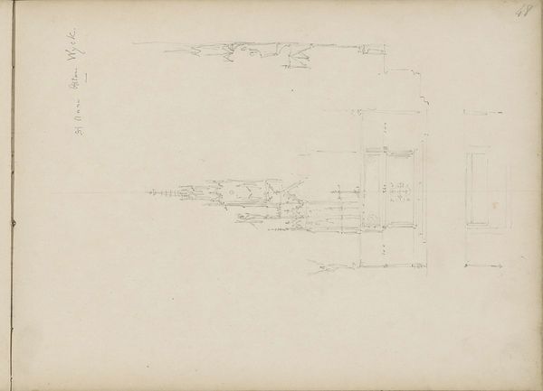
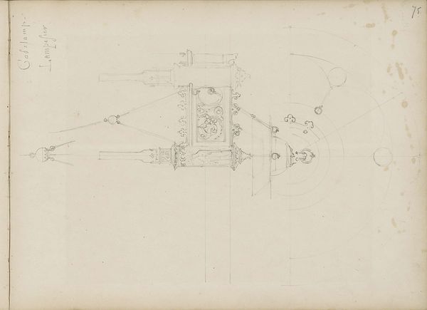
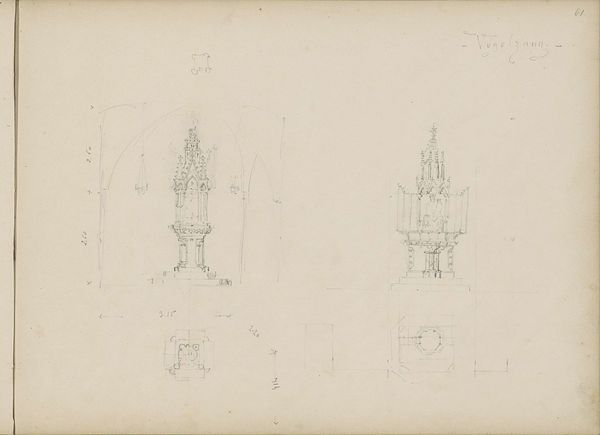
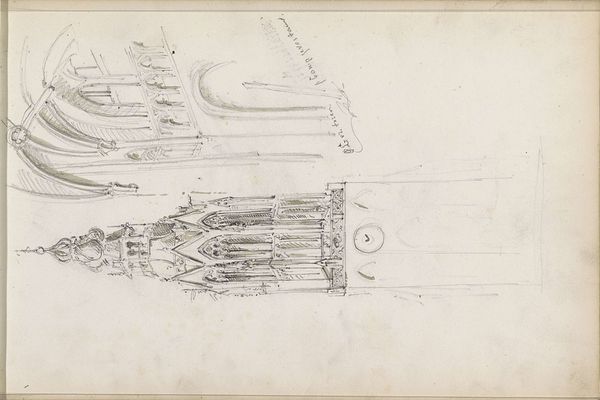
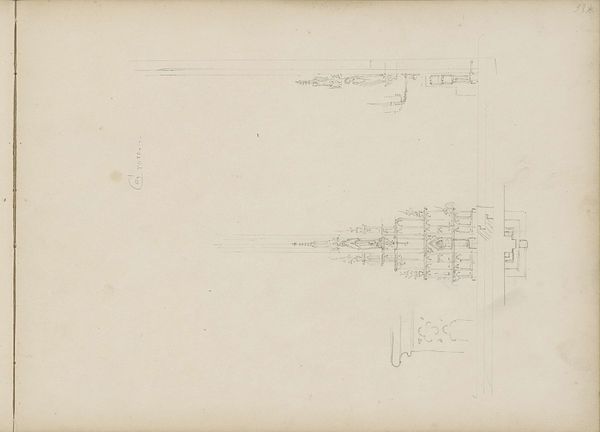
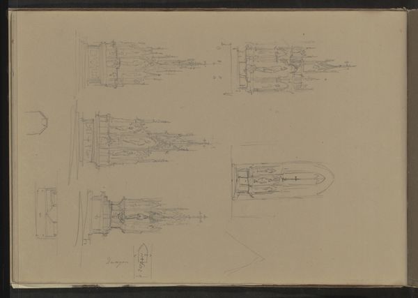
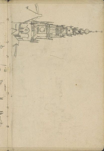
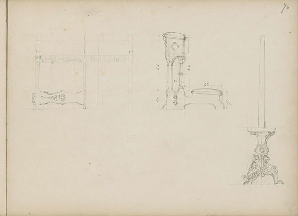
Editor: We're looking at Pierre Joseph Hubert Cuypers' "Hoogaltaar en tabernakel, Gemert," a drawing from 1857, housed at the Rijksmuseum. It’s a delicate pencil sketch on aged paper. The lines are so light; it almost feels like a whisper. What stands out to you as you observe its formal qualities? Curator: Indeed. Observe how Cuypers orchestrates the interplay of line and space. Note the architectural structure meticulously rendered through the artist's chosen medium. The paper's surface itself functions as a grounding element, providing a tactile depth to the visual experience. Consider the visual organization—the hierarchy established through line weight and spatial arrangement. Does the composition lead the eye to a specific focal point? Editor: It's interesting that you point out the hierarchy. My eyes are drawn to the verticality, from the base of the altar, and I am almost propelled upwards, past all that fine detail, right to the top, despite its sketchiness. Why do you think Cuypers made certain lines bolder than others? Curator: It appears Cuypers employs variation in line thickness to articulate form and depth, structuring our gaze within the composition. This strategic articulation could indicate which elements he deemed significant in relation to the whole architectural scheme. The thinner lines might represent planes further removed from the viewer, creating a sense of depth. Is there any repetition of shapes or forms that seem to emphasize a particular symbolic meaning through purely visual language? Editor: I notice the repetition of rectangular forms, both horizontally and vertically, in the altar’s design. It gives a sense of structure and maybe even...stability? Curator: Precisely. Now, contemplate the visual impact of the text accompanying the sketches. How does the inclusion of handwriting contribute to the overall aesthetic experience and intellectual understanding? Editor: Good question! I hadn't focused on that. The cursive feels like a personal touch, like a peek into the artist's process… a dialogue, in itself. Curator: It would seem the intention is to unify elements into a visually harmonic tableau. Consider what we have uncovered through this exercise in looking closely; what could that mean in our further investigation? Editor: I guess looking at those details provides a deeper insight into how all those separate, intrinsic elements fit together to inform the whole experience of the sketch and Cuypers’ thinking behind the work. Thank you.
Comments
No comments
Be the first to comment and join the conversation on the ultimate creative platform.
More like this