About this artwork
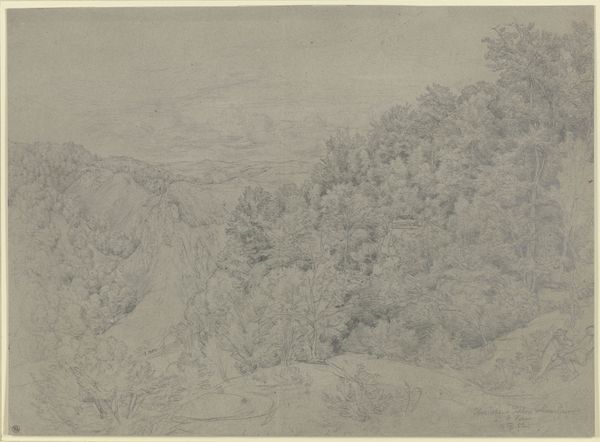
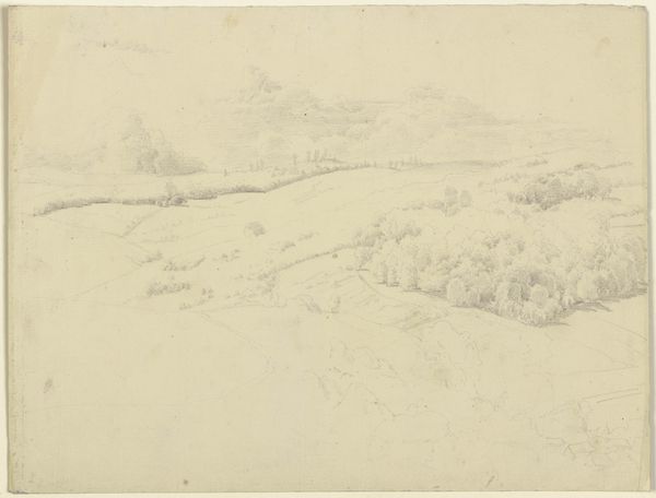
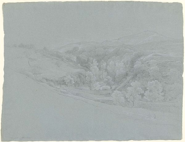
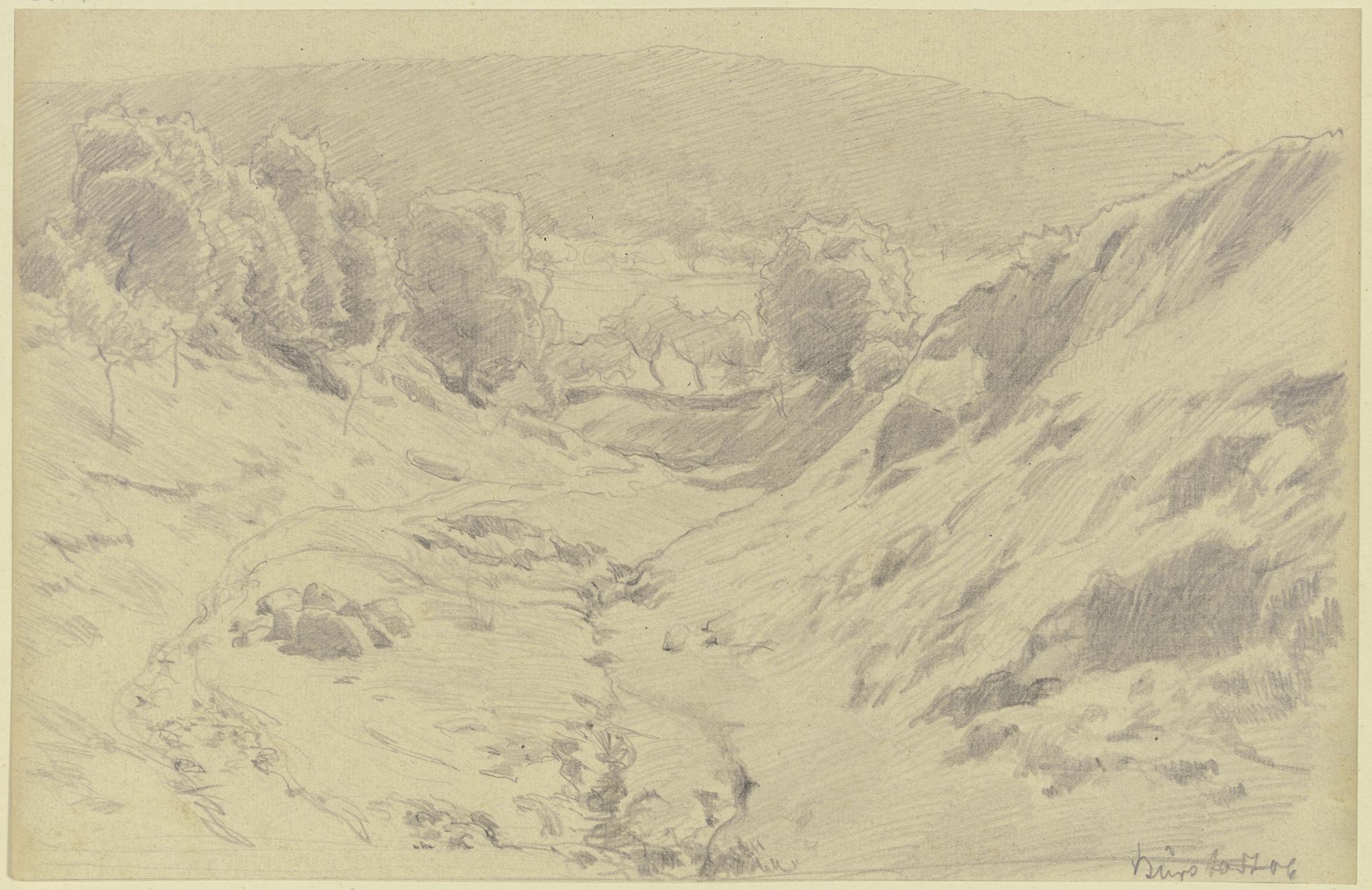
Editor: This is Jacob Happ's "Valley Cut," a pencil drawing from 1906. It has such a serene and almost dreamy quality. The composition really draws you into the valley. What strikes you most about it? Curator: Primarily, the formal relationships. Note how the artist deploys hatching and cross-hatching to define form and volume. The directional lines aren't merely descriptive; they construct the spatial recession, leading the eye from the foreground's textured earth towards the implied light in the distance. Editor: So, it's more than just a picture of a valley? Curator: Indeed. Observe the balance between the dense, shaded areas and the lighter, open spaces. This juxtaposition creates a visual rhythm. Furthermore, consider the conscious decision to render certain elements—the foliage, for example—with a soft, diffused quality. What does that softness evoke for you? Editor: A sense of stillness? Or maybe a focus on light, rather than distinct details? It feels very subtle. Curator: Precisely. Happ prioritizes the interplay of light and shadow over precise representation. The materiality of the pencil on paper itself becomes a key element, lending the work a delicate, almost ephemeral presence. It transcends simple mimesis. Editor: I see that, now that you mention the paper itself! The texture almost adds another layer to the landscape. I've learned that form isn't just *how* something looks, but also *why* it looks that way. Curator: Precisely. It is through that very careful handling of materials and that interplay of light that form takes shape.
Artwork details
- Medium
- drawing, pencil
- Location
- Städel Museum
- Copyright
- Public Domain
Tags
Comments
Share your thoughts
About this artwork
Editor: This is Jacob Happ's "Valley Cut," a pencil drawing from 1906. It has such a serene and almost dreamy quality. The composition really draws you into the valley. What strikes you most about it? Curator: Primarily, the formal relationships. Note how the artist deploys hatching and cross-hatching to define form and volume. The directional lines aren't merely descriptive; they construct the spatial recession, leading the eye from the foreground's textured earth towards the implied light in the distance. Editor: So, it's more than just a picture of a valley? Curator: Indeed. Observe the balance between the dense, shaded areas and the lighter, open spaces. This juxtaposition creates a visual rhythm. Furthermore, consider the conscious decision to render certain elements—the foliage, for example—with a soft, diffused quality. What does that softness evoke for you? Editor: A sense of stillness? Or maybe a focus on light, rather than distinct details? It feels very subtle. Curator: Precisely. Happ prioritizes the interplay of light and shadow over precise representation. The materiality of the pencil on paper itself becomes a key element, lending the work a delicate, almost ephemeral presence. It transcends simple mimesis. Editor: I see that, now that you mention the paper itself! The texture almost adds another layer to the landscape. I've learned that form isn't just *how* something looks, but also *why* it looks that way. Curator: Precisely. It is through that very careful handling of materials and that interplay of light that form takes shape.
Comments
Share your thoughts