graphic-art, typography, poster
#
pop art-esque
#
graphic-art
#
pop art
#
typography
#
geometric
#
abstraction
#
poster
#
modernism
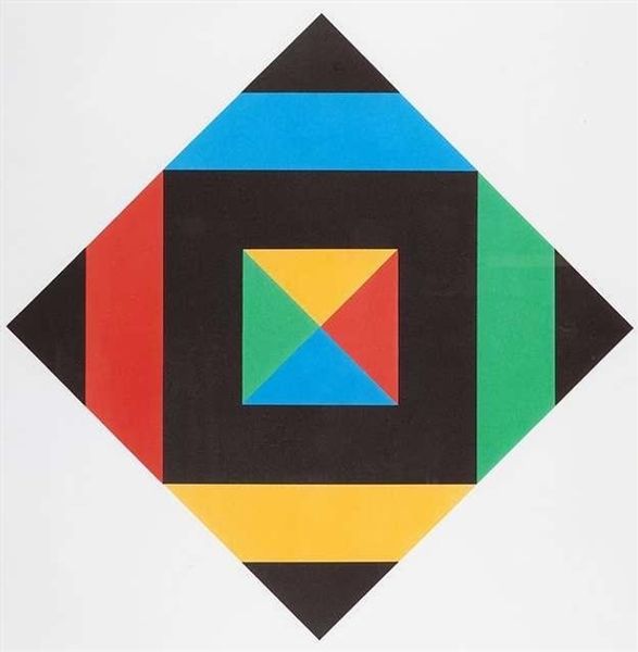
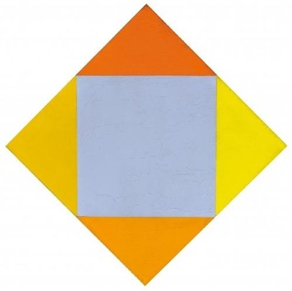
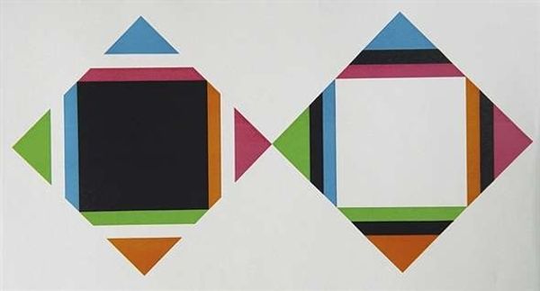
Dimensions: 48 x 35 cm
Copyright: Johannes Itten,Fair Use
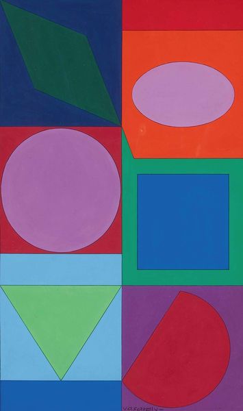
Curator: Standing before us is Johannes Itten’s “Plakat für Ausstellung Baden-Baden” from 1965, a striking poster showcasing the principles of modernism. Editor: It's certainly visually arresting! My first impression is its boldness—a playful, almost childlike assembly of geometric shapes. It’s got this intriguing balance between simplicity and vibrancy. Curator: Itten's Bauhaus background is key here. Notice the reduction to basic geometric forms—squares, triangles—and a deliberate selection of colours. This aligns with the Bauhaus ethos of functionality and abstraction, aiming to create a universal visual language. How do you see this intersecting with social or political themes? Editor: In the '60s, visual communication became intertwined with cultural identity and protest. It's interesting to consider if this clean, orderly aesthetic was meant to stand in contrast to a society grappling with social unrest, or if the pure aesthetic was an invitation towards a new type of utopian ideal? Did its Bauhaus influence resonate with leftist ideas through functionality, or not? Curator: Indeed. The use of graphic design and bold colours, while seemingly innocuous, played a huge role in creating a visual culture accessible to the masses. Think about its role within institutional histories. Did exhibition posters shape taste and discourse, beyond simply advertising? What impact might this image have on our perception of Swiss design or German art movements? Editor: I agree. Thinking about the way it democratizes art and challenges bourgeois aesthetics by reducing elements and prioritizing readability for the masses—there’s an argument there for art breaking barriers through its aesthetic and approach to societal norms. Curator: The colour choices feel considered, don’t they? This tension of contrasts and harmonies is, I think, part of its enduring appeal and what invites constant discourse on abstract ideals. Editor: Right. Despite its inherent flatness, the relationship between the individual and abstract colour creates so many layers that are conceptually fascinating. I feel it asks a lot of different and complex questions regarding identity and community in relation to shape and colour, Curator: Ultimately, "Plakat für Ausstellung Baden-Baden" offers us an example of how seemingly simple images carry complex layers of cultural and aesthetic meaning, shaping visual narratives across time. Editor: And perhaps shows how, even in apparent abstraction, art inevitably echoes—or perhaps challenges—the world around it.
Comments
No comments
Be the first to comment and join the conversation on the ultimate creative platform.
More like this