Dimensions: overall: 254 × 279.4 cm (100 × 110 in.)
Copyright: National Gallery of Art: CC0 1.0
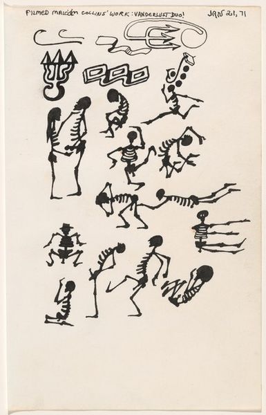
Editor: We're looking at "Black and the Red II" by Nancy Spero, created in 1992 using mixed media, ink, and drawing on paper. It strikes me as a powerful, fragmented narrative. What compositional elements stand out to you? Curator: I'm drawn to the rhythmic repetition of figures, organized horizontally, it creates a visual tempo. Note the stark contrast between the figures rendered in linear ink and the bold, solid shapes in black and red. The work gains a tension by virtue of line and volume operating within their own economies of representation. Editor: It's interesting that you point out the tension, it's visually very dynamic. What purpose might these visual contrasts serve? Curator: It invites contemplation on the figure-ground relationship. Observe how the ground almost disappears, giving the forms priority. One sees a dialectic: bodies against the red/black figure. Editor: How does the materiality of the artwork—the ink, the paper—contribute to its overall effect? Curator: The choice of materials lends the work a sense of immediacy and rawness. Paper supports spontaneous form that is immediate in gesture, without laborious production, yielding semiotic possibilities. Editor: I hadn't considered the rawness coming from the media itself. I was focused on the figuration. Curator: Visual elements give clues to cultural references but, like you said, there's the figures of dance in repetitive format that also stand alone compositionally as bodies of expression. Editor: I learned so much. I never considered this degree of separation in the visual forms. It offers many routes to follow! Curator: The power of visual language resides in that kind of dynamic experience and inquiry!
Comments
No comments
Be the first to comment and join the conversation on the ultimate creative platform.
More like this