Dimensions: 95.5 x 120 cm
Copyright: Public domain
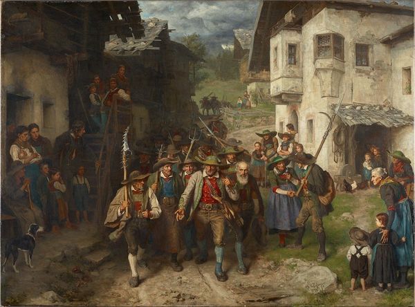
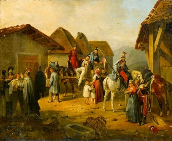
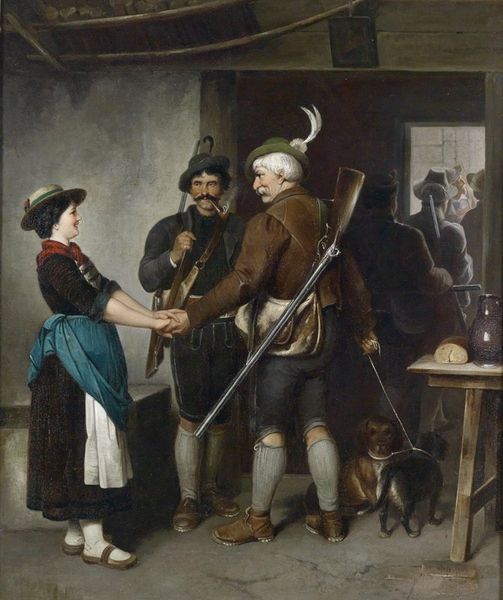
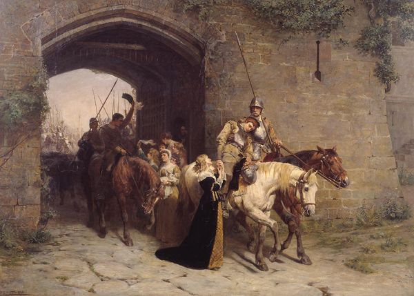
Editor: This is Gerolamo Induno's "The Departure for the Field" from 1866, executed in oil paint. There’s a palpable sense of melancholy emanating from the scene, wouldn’t you agree? What draws your attention when you examine this painting? Curator: Immediately, I am struck by the composition. The artist has carefully arranged the figures, creating a strong diagonal line that leads the eye from the departing soldier, who stands centrally and whose positioning directs the viewer further towards the waiting troops in the background. The contrast between the tight cluster of figures bidding farewell and the distant, ordered ranks is quite effective. Do you observe how Induno uses light and shadow to intensify this emotional contrast? Editor: I do! The figures in the foreground are much more brightly lit, really emphasizing their emotions compared to the almost dreamlike soldiers in the distance. How does the artist achieve this depth, apart from light? Curator: Notice the use of aerial perspective, wherein the background colours are muted, creating distance. This heightens the depth of field. Additionally, Induno employs meticulous detail in the foreground—look closely at the rendering of the fabrics, the facial expressions, and compare that with the broadly applied strokes in the landscape elements and distant army, therefore, separating depth and tonal variety. Editor: The textures really stand out now that you mention it! Are there other ways Induno focuses attention to the characters’ relationships? Curator: Observe how the figures in the immediate family unit subtly mirror one another in terms of posture and gaze, particularly the soldier and the women on either side. Furthermore, note the inclusion of sharp, rigid edges in the solider's equipment and clothing contrasting against the curved nature of the family to display the separation occurring. It’s an interesting contrast, reflecting the formal demands of duty against familial connection, no? Editor: Absolutely. It makes the emotional weight of the moment even more tangible, analyzing those contrasts. Thanks! Curator: Indeed, the careful interplay of these formal elements provides us access to deeper thematic nuances. The composition reveals how intertwined material components serve artistic unity.
Comments
No comments
Be the first to comment and join the conversation on the ultimate creative platform.
More like this