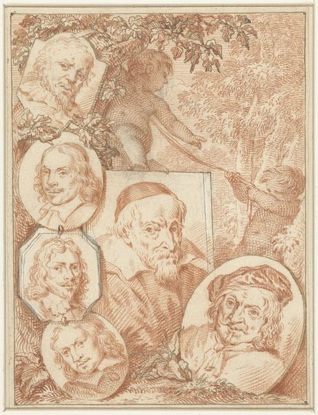
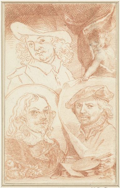
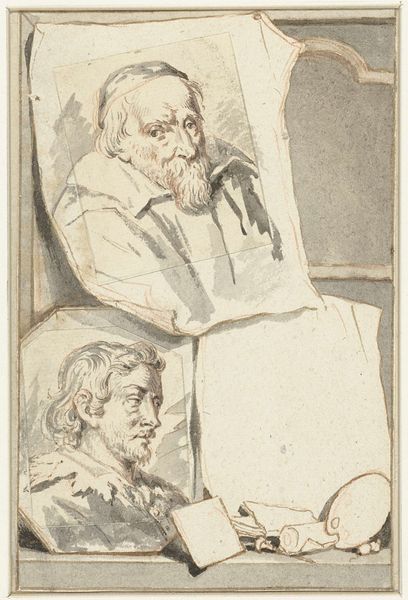
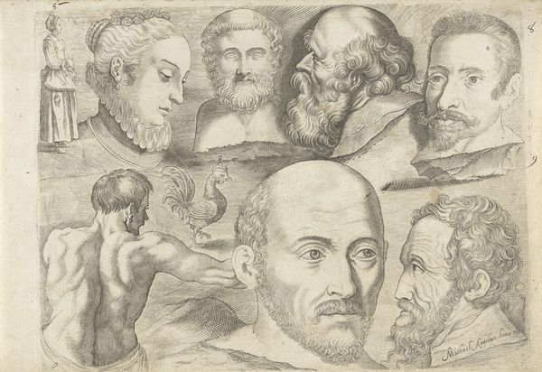
Portretten van Daniel Seghers, Jodocus de Momper en Cornelis de Vos 1708 - 1780
0:00
0:00
jacobhoubraken
Rijksmuseum
drawing, paper, pencil, graphite, pen
#
portrait
#
drawing
#
baroque
#
pencil sketch
#
paper
#
11_renaissance
#
sketch
#
pencil
#
graphite
#
pen
#
portrait drawing
#
pencil art
#
watercolor
Dimensions: height 151 mm, width 97 mm
Copyright: Rijks Museum: Open Domain
Editor: Here we have "Portretten van Daniel Seghers, Jodocus de Momper en Cornelis de Vos," a drawing made between 1708 and 1780 by Jacob Houbraken. It's rendered in pencil, pen, and graphite on paper. What strikes me is the sort of collage effect, with seemingly disparate portraits arranged together, along with the memento mori elements. What stands out to you? Curator: Indeed, the arrangement is quite striking. Houbraken seems less interested in unified narrative or symbolic resonance, and more fascinated by exploring line, form, and the tension between varying modes of representation within a single plane. Note how each portrait exists in its own discrete spatial register, framed differently and possessing its own distinct textural quality. Editor: I see that now. So you are focusing on how the different styles create that contrast? Curator: Precisely. Consider the contrast between the round, softly shaded face in the central medallion versus the angular hatching defining the lower portrait. How do these juxtapositions affect the viewer's perception of each individual image and the drawing as a whole? Do we focus on likeness or are we pulled more to the way these portraits represent the surface qualities of drawing? Editor: I'm starting to see how Houbraken used the structure itself as a means of visual expression, setting up relationships through form rather than context. It’s fascinating how much meaning can be derived simply from the composition itself! Curator: Precisely. By carefully examining the formal relationships, the drawing itself offers up more for interpretation than biographical facts alone.
Comments
No comments
Be the first to comment and join the conversation on the ultimate creative platform.
More like this