Dimensions: height 150 mm, width 90 mm
Copyright: Rijks Museum: Open Domain
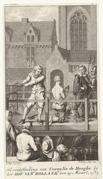
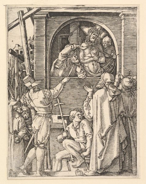
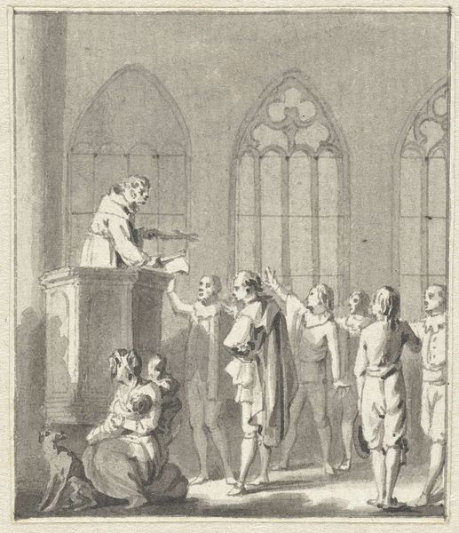
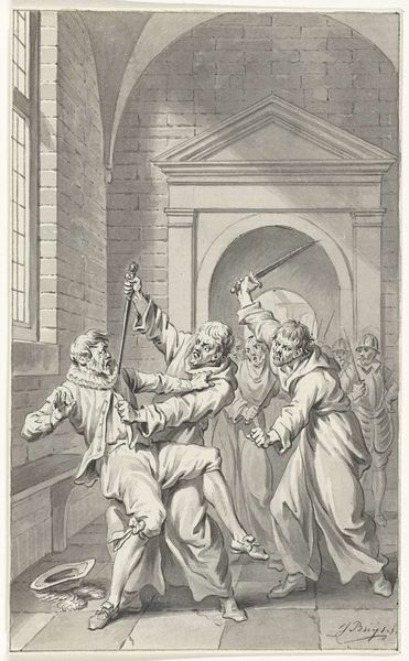
Editor: So, here we have Jacobus Buys' "Decapitation of the Engraver Cornelis de Hooghe" from around 1787-1789, done in ink on paper. I have to say, it's quite striking. The almost casual depiction of such a brutal scene is what stands out the most. What's your take on this? Curator: Well, darling, it makes you wonder about Buys' mindset, doesn't it? Imagine him, sipping his tea, and then meticulously rendering this moment of high drama. But let’s dig deeper. Neoclassicism was all about order, reason, and emulating the greats. Here, though, the subject is anything *but* orderly. The precise lines almost amplify the horror, don’t they? Are we meant to admire the composition or recoil from the event? Or perhaps both? Editor: It is unsettling how clean the lines are, considering. What about the choice of using ink on paper? Curator: Good question! It speaks to a tradition of documentation, like an official record…but done with the flourish of an artist. This wasn’t a quick sketch; it’s a carefully considered statement, or perhaps more precisely, a commentary masked as documentation. Ink offers precision but lacks the softening effects of, say, oil paint. The starkness mirrors the finality of the execution. Cruel, perhaps? What do you think of that contrast? Editor: The "statement masked as documentation" definitely gives me a lot to think about. Curator: Yes, isn’t it scrumptious? The drama, the history, all served on a platter of perfectly rendered lines! It is really something else. So, what’s the big takeaway for you from looking at this piece? Editor: I think that there's so much in it that might get overlooked on the first pass. So thanks for the layered explanation. Curator: My pleasure, dear. Every artwork is like a layered cake of meaning!
Comments
No comments
Be the first to comment and join the conversation on the ultimate creative platform.
More like this