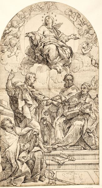
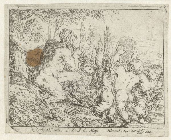
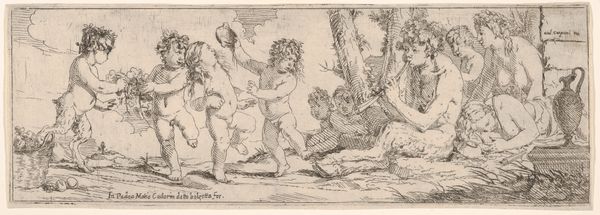
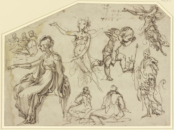
drawing, ink, pen
#
drawing
#
neoclassicism
#
pen sketch
#
ink
#
romanticism
#
pen
#
cityscape
#
history-painting
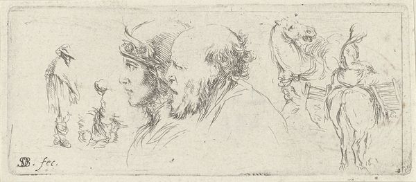
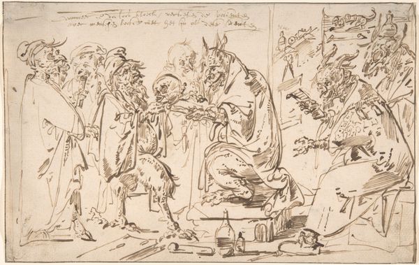
Dimensions: height 94 mm, width 107 mm
Copyright: Rijks Museum: Open Domain
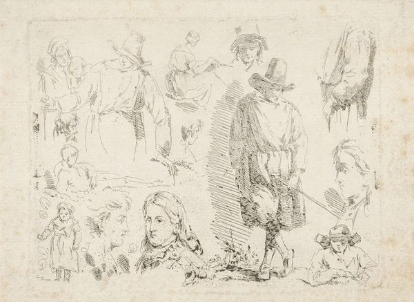
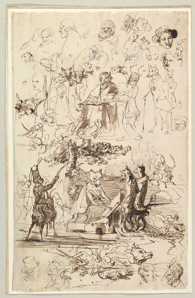
Curator: This intricate pen and ink drawing is entitled “Toestand van Nederland in 1670 en 1810,” created by Hermanus Fock between 1810 and 1813. It’s currently part of the Rijksmuseum collection. Editor: My first impression is… fragmented. The drawing style appears quite spontaneous and is full of symbolism, even a bit overwhelming at first glance. It looks like several ideas layered on top of each other. Curator: Indeed. Fock's drawing is rich in historical commentary, offering a comparative view of the Netherlands across two significant periods. 1670 marked a time of economic prosperity known as the Dutch Golden Age, whereas 1810 saw the Netherlands under French rule. Editor: Focusing on the formal qualities, there's a real dynamism in the composition. The use of line is quite varied, creating depth and texture despite the limited tonal range of pen and ink. Notice how some figures are rendered with detailed precision, while others are barely suggested with quick strokes. Curator: The placement of these figures is really fascinating. The prominent figures probably represent historical figures or symbolic personifications of power, while the background vignettes seem to depict everyday life, the economy and political tensions. This illustrates the influence of leadership in these eras, perhaps alluding to specific historical events and figures that defined these periods. Editor: It’s interesting how Fock juxtaposes these elements, blurring the lines between past and present. The chaotic arrangement contributes to the emotional intensity, and it reflects how unsettling times must have felt. Curator: The drawing, being produced during a time of political upheaval, suggests the artist’s perspective on Dutch national identity and its resilience. This reflects the broader Romantic movement’s interest in national identity and the emotional weight of history. Editor: Looking closer, the varied line work seems to contribute meaning by indicating time; thick, solid marks describe things that exist in 1670, where the lighter scratchy markings allude to France's effects on Dutch identity and rule. The artist has successfully employed the line as a passage of time. Curator: Precisely. And the visual chaos seems intended to capture the anxieties and uncertainties of the time. It also functions as an argument that through its low periods, The Netherlands may remain one singular identity. Editor: Well, now that I have looked closer at Fock's process, the composition becomes a coherent vision, that perhaps we all should consider in our understanding of cultural nationalism in Romantic artwork. Curator: And for me, analyzing "Toestand van Nederland in 1670 en 1810” underlines the critical relationship between political context, artistic production, and national sentiment in Dutch history.
Comments
No comments
Be the first to comment and join the conversation on the ultimate creative platform.
More like this