About this artwork
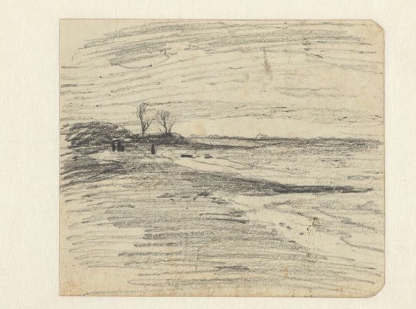
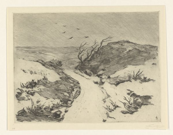
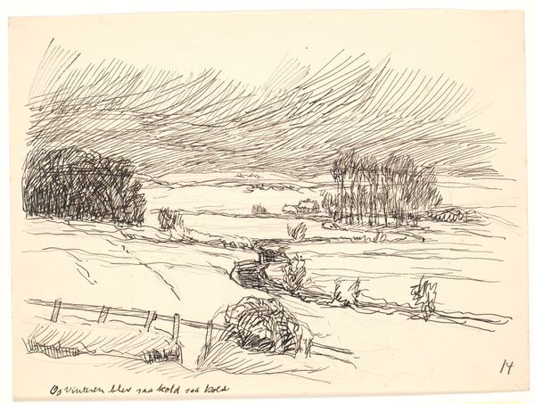
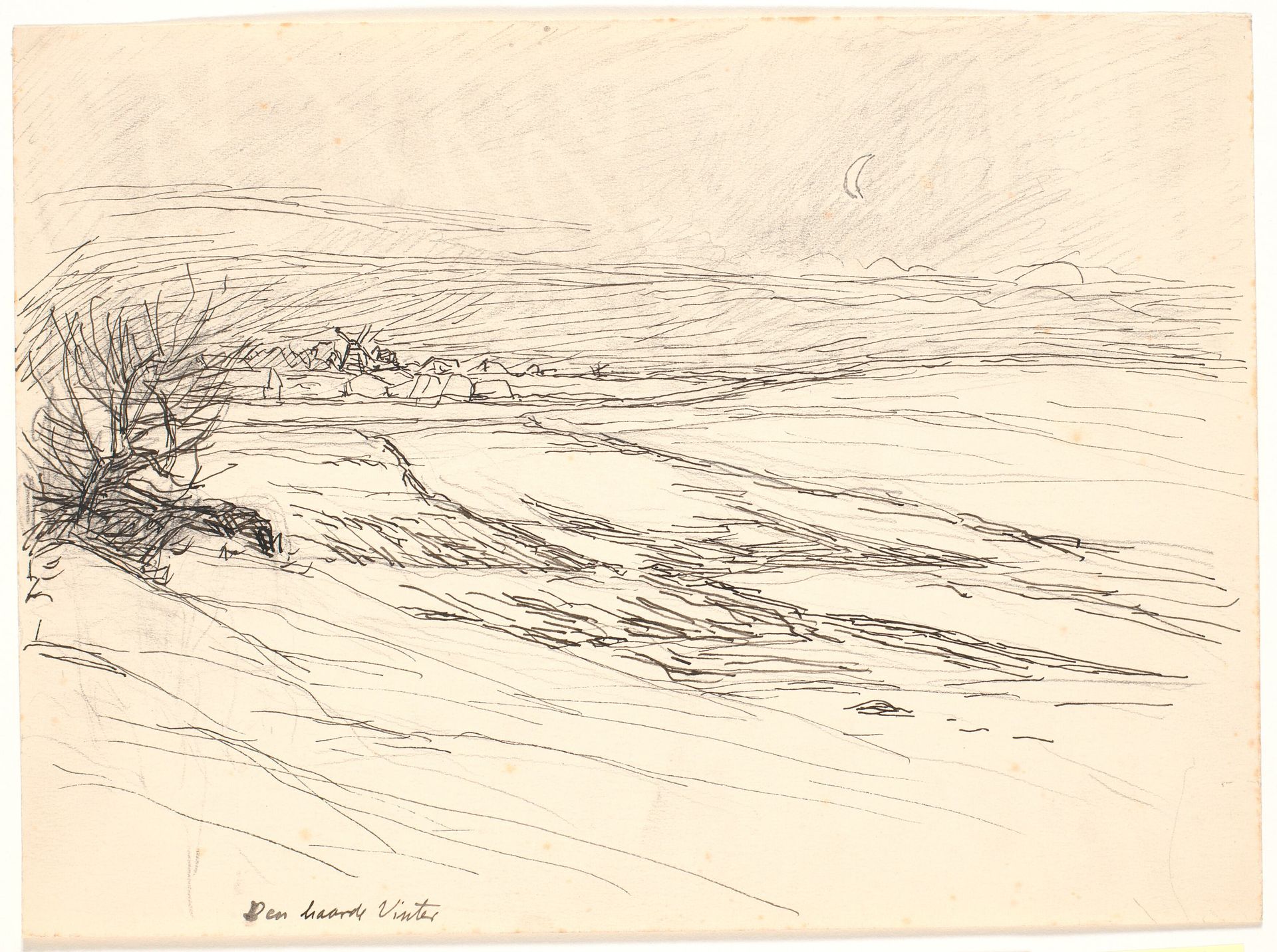
Editor: This is Fritz Syberg's "Den haarde Vinter," created in 1928 using graphite. It's a stark winter landscape that evokes such a sense of cold desolation. What do you see when you look at this piece? Curator: Immediately, my eye is drawn to the linear quality of the drawing. The artist masterfully uses hatching and cross-hatching to define form and texture, creating a nuanced interplay of light and shadow. Consider how the horizon line is almost a relentless straight, and the strategic variation in line weight. Notice also the composition and economy of the design of the piece, creating visual interest in this harsh, colorless vista. What do you observe in the foreground? Editor: I see the dense tangle of a bare tree or bush. Its form seems so much darker and more detailed than anything else. Why do you think Syberg chose that level of stark contrast? Curator: Perhaps it is acting as a visual anchor but also creating depth with the use of that very intricate detail against the sweeping plains and simplified shapes that recede into the distance. This contrast emphasizes the desolate vastness while drawing our attention to the minute details within it, don't you think? Note how even the thin sliver of a crescent moon punctuates the drawing’s minimalist upper register. It’s not about direct representation; it's about the relationships between the forms and marks. Editor: So, it’s less about the literal scene and more about how all these compositional elements interact to create a feeling. It’s almost like the moon is both physically in the distance, but also pushing against it. Curator: Precisely. The relationships of form and tone, the juxtaposition of the natural and stylized. These all contribute to a successful image. Editor: That really shifted how I see it! I was stuck on the "what" and not the "how." Thanks. Curator: My pleasure.
Den haarde Vinter 1928
Artwork details
- Dimensions
- 248 mm (height) x 339 mm (width) (bladmaal)
- Location
- SMK - Statens Museum for Kunst
Comments
No comments
About this artwork
Editor: This is Fritz Syberg's "Den haarde Vinter," created in 1928 using graphite. It's a stark winter landscape that evokes such a sense of cold desolation. What do you see when you look at this piece? Curator: Immediately, my eye is drawn to the linear quality of the drawing. The artist masterfully uses hatching and cross-hatching to define form and texture, creating a nuanced interplay of light and shadow. Consider how the horizon line is almost a relentless straight, and the strategic variation in line weight. Notice also the composition and economy of the design of the piece, creating visual interest in this harsh, colorless vista. What do you observe in the foreground? Editor: I see the dense tangle of a bare tree or bush. Its form seems so much darker and more detailed than anything else. Why do you think Syberg chose that level of stark contrast? Curator: Perhaps it is acting as a visual anchor but also creating depth with the use of that very intricate detail against the sweeping plains and simplified shapes that recede into the distance. This contrast emphasizes the desolate vastness while drawing our attention to the minute details within it, don't you think? Note how even the thin sliver of a crescent moon punctuates the drawing’s minimalist upper register. It’s not about direct representation; it's about the relationships between the forms and marks. Editor: So, it’s less about the literal scene and more about how all these compositional elements interact to create a feeling. It’s almost like the moon is both physically in the distance, but also pushing against it. Curator: Precisely. The relationships of form and tone, the juxtaposition of the natural and stylized. These all contribute to a successful image. Editor: That really shifted how I see it! I was stuck on the "what" and not the "how." Thanks. Curator: My pleasure.
Comments
No comments