#
gouache
#
figurative
#
water colours
#
possibly oil pastel
#
oil painting
#
acrylic on canvas
#
underpainting
#
painting painterly
#
watercolour bleed
#
watercolour illustration
#
watercolor
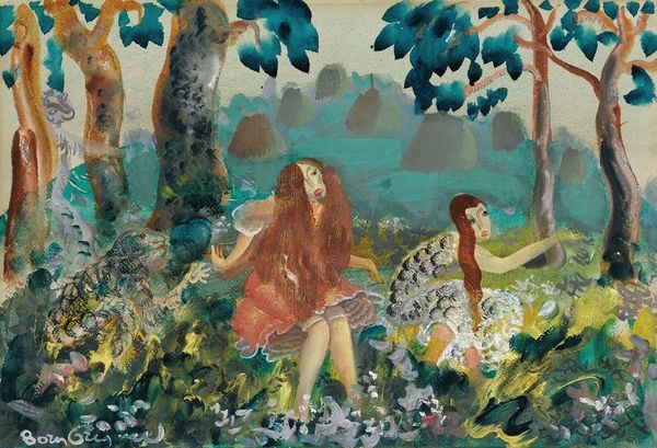
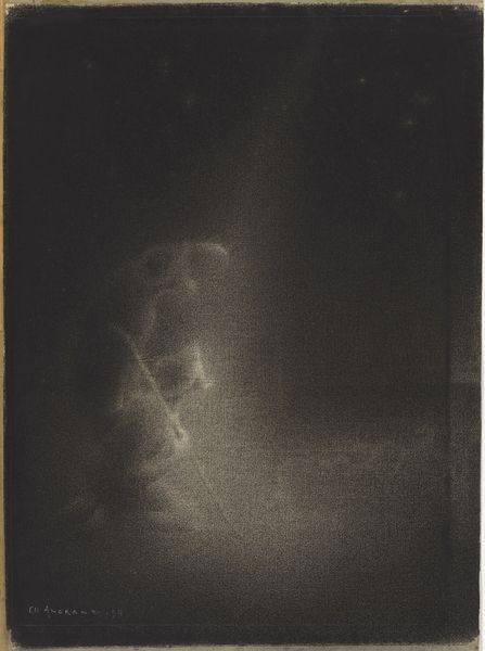
Copyright: Public Domain: Artvee
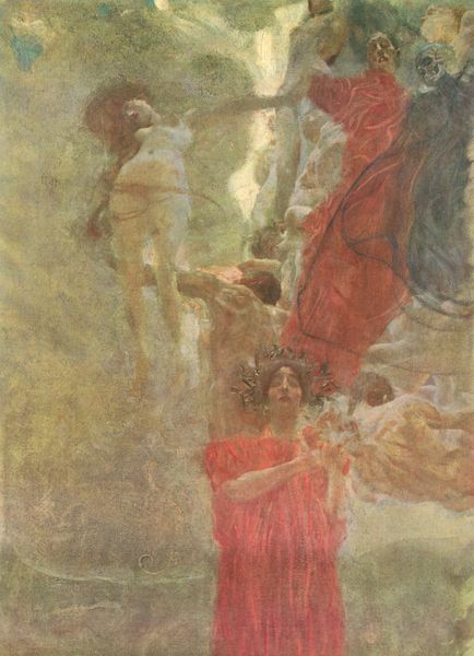
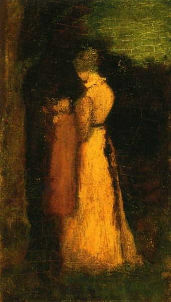
Editor: We're looking at "The Dancers," by Arthur Bowen Davies. It looks like it's done in gouache or watercolors. The misty background and the soft outlines give the whole scene an ethereal quality. What do you see when you look at this piece? Curator: Immediately, my eye is drawn to the rhythmic composition. Notice how Davies uses the placement of the figures, both the foregrounded dancer and the distant trio, to create a visual cadence. Consider the interplay between the verdant ground, the veiled sky, and the positioning of limbs—how does this calculated arrangement impact your viewing experience? Editor: It almost feels like a snapshot, capturing movement in a still image. It makes me wonder what the relationship between the dancers are? Curator: Precisely! Now, let’s consider the formal properties – observe the chromatic restraint; Davies employs a muted palette of greens, yellows, and browns. Note how the composition does not allow harsh contrast or colour conflict. It suggests rather a cohesive tonal relationship. Are we invited to focus more on the composition that depicts a mood? What would happen if bolder colour selections were to appear? Editor: I suppose bolder colours would risk disturbing the peaceful ambience. By keeping it muted, we focus more on the shapes and poses of the figures and the atmosphere that surrounds them. Curator: Precisely. It's the considered application and cohesion that elevate the painting above a simple narrative scene. Through colour, form, and carefully constructed arrangement of representational characters and shapes, we gain a piece that exudes an evocative energy. Editor: I hadn’t considered the harmony and flow. I can really appreciate the composition more deeply now!
Comments
No comments
Be the first to comment and join the conversation on the ultimate creative platform.
More like this