drawing, paper, pen
#
drawing
#
art-nouveau
#
pen sketch
#
paper
#
form
#
geometric
#
line
#
pen work
#
pen
Dimensions: height 140 mm, width 292 mm
Copyright: Rijks Museum: Open Domain
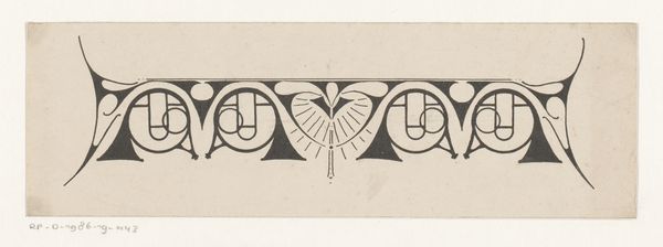
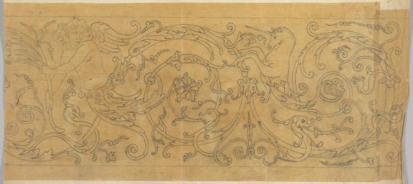
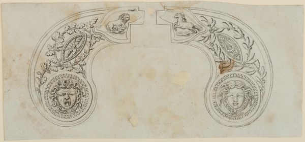
Curator: This intricate pen sketch, created by Reinier Willem Petrus de Vries between 1884 and 1952, is titled "Ontwerp voor een titelhoofd met twee pauwen," or "Design for a Title Head with Two Peacocks." Editor: Immediately, the symmetry grabs you. It feels like a heraldic emblem, stylized, but somehow delicate despite the bold lines. Curator: The drawing style adheres closely to the Art Nouveau movement, doesn't it? You see it in the flowing lines, the almost obsessive use of decorative elements. Art Nouveau embraced nature and ornamentation as a rebellion against industrialization, so the peacock, a symbol of beauty and pride, would be a natural fit. Editor: It certainly speaks to that yearning for beauty amidst growing industry, a tension still resonant today. Peacocks, historically, were also linked to royalty, opulence. This wasn't art for the masses, was it? Curator: Possibly commissioned work. But think about the symbolic resonance – the peacock isn't merely about pride; its feathers were believed to symbolize incorruptibility and immortality. Consider it placed above a title. What promise is it suggesting to a prospective patron or viewer? The eye-like markings in the feathers…they’re often connected with all-seeing wisdom. Editor: And by placing them flanking, symmetrical, and poised over what looks like a palace gable of some kind—isn’t there an intention of moral equivalency or judgement being suggested as well? Reinier appears to take that symmetry as a structural base, because its visual form certainly takes precedent over representational function here. Curator: Indeed. The composition guides us to decode more than just the obvious image of majestic birds, we perceive it on structural level too. De Vries uses the visual language of symmetry to evoke tradition and an appeal to longevity or incorruptible nature. It makes one wonder what exact institution would this title heading might have graced… Editor: It invites us to speculate! A study of architectural institutions of the time might lead us closer to its original place in public imagination. What a thought-provoking piece. Curator: Absolutely. De Vries’ skillful design work gives insight to a unique dialogue of historical context and enduring symbols in the pursuit of understanding art's public function.
Comments
No comments
Be the first to comment and join the conversation on the ultimate creative platform.
More like this