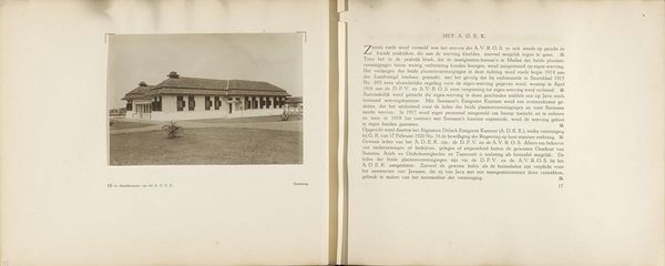
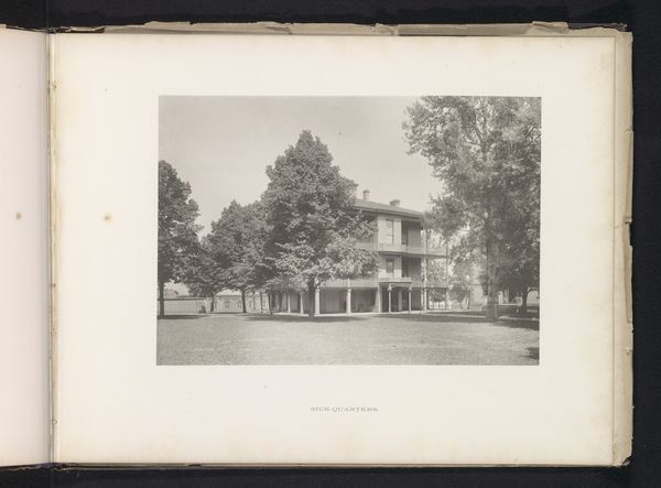
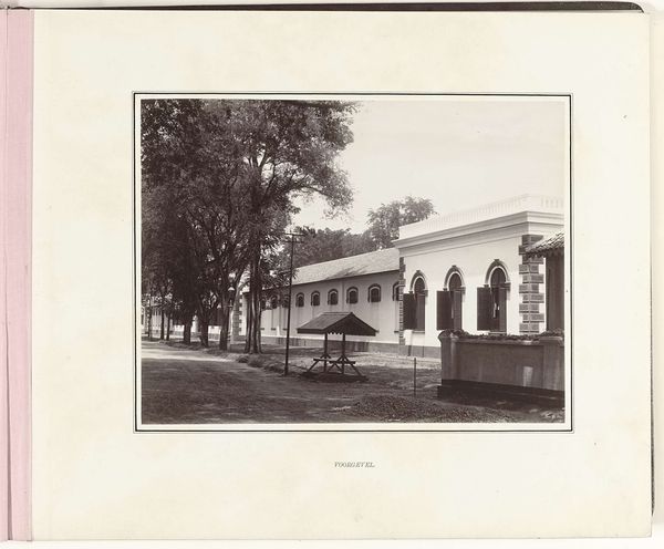
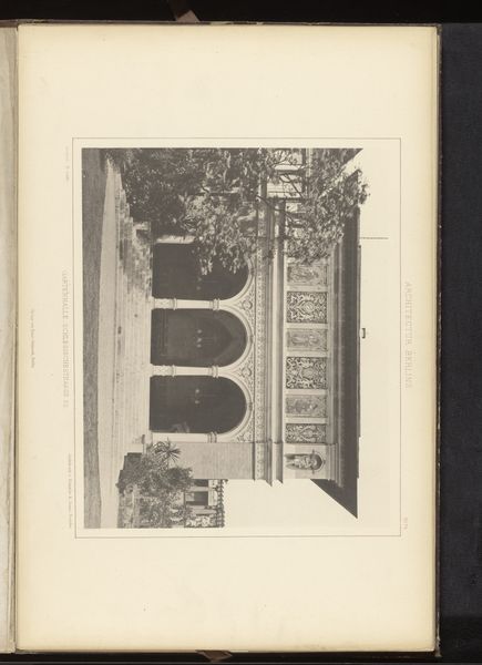
Pagina 20 en 21 van fotoboek van de Algemeene Vereeniging van Rubberplanters ter Oostkust van Sumatra (A.V.R.O.S.) c. 1924 - 1925
0:00
0:00
jwmeyster
Rijksmuseum
#
aged paper
#
parchment
#
hand drawn type
#
personal sketchbook
#
fading type
#
thick font
#
handwritten font
#
golden font
#
watercolor
#
historical font
Dimensions: height 240 mm, width 310 mm
Copyright: Rijks Museum: Open Domain
Editor: This is a page from a photo book, "Pagina 20 en 21 van fotoboek van de Algemeene Vereeniging van Rubberplanters ter Oostkust van Sumatra," or A.V.R.O.S., created around 1924 or 1925 by J.W. Meyster. It's housed at the Rijksmuseum. I am struck by the contrast between the aged paper and the crisp architectural lines of the building. What aspects of its composition stand out to you? Curator: Focusing solely on the image's inherent qualities, observe how the photographer’s use of symmetry dictates our understanding of the image. The building depicted in the photograph dominates the composition; it is rigidly centered, lending it a sense of power and order. Consider the geometrical interplay: the rectangular building contrasts against the organic, though carefully manicured, landscape. Note also the font used for the descriptive text; its bold weight anchors the composition, preventing the building's form from being visually destabilized within its picture plane. Editor: The symmetrical layout of the page itself mirrors the photograph’s composition, doesn’t it? The text on the right balances the image on the left. Was this balance a common element of design at the time, to bring attention to the central image? Curator: Indeed. The deliberate pairing of image and text reinforces the book's intended meaning. The aged, slightly yellowed parchment, offers texture that might affect our initial viewing of the image and typeface. Also observe the interplay of positive and negative space in the typeface itself and reflect on the role played by symmetry. Editor: It's amazing how analyzing those purely visual components reveals so much about the artistry behind it. I hadn't considered the font as such an integral structural element before! Curator: By attending closely to these relationships we uncover structural components, which deepens our experience of visual forms, and invites ongoing interpretation.
Comments
No comments
Be the first to comment and join the conversation on the ultimate creative platform.
More like this