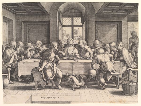
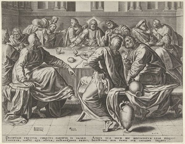
print, engraving
#
baroque
# print
#
perspective
#
figuration
#
group-portraits
#
history-painting
#
italian-renaissance
#
engraving
Dimensions: height 388 mm, width 521 mm
Copyright: Rijks Museum: Open Domain
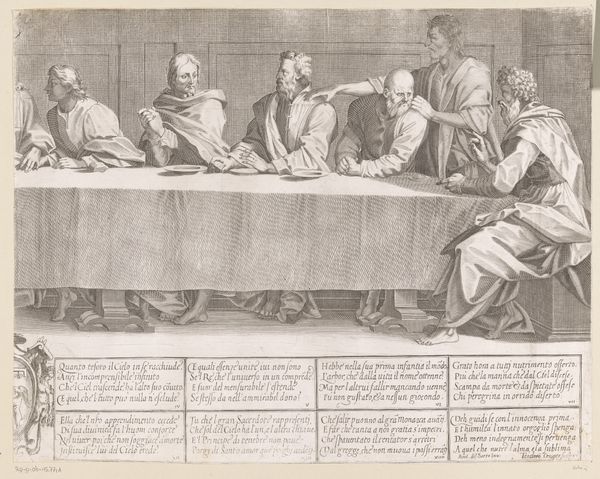
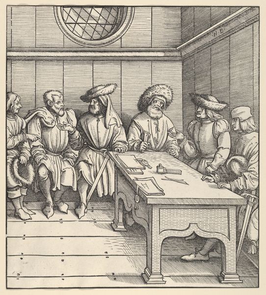
Curator: We're looking at "Het Laatste Avondmaal (linkerdeel)", or "The Last Supper (left part)", an engraving that likely dates between 1590 and 1621. Editor: My first impression is one of solemn observation. There's a quiet tension in the room; everyone seems caught in their own world. Curator: Yes, and that sense of quietude seems deliberate. The piece embodies elements of the Baroque style—a period that followed the Renaissance. Although, technically speaking, with this focus on clear lines, humanism, and geometry, the work retains the feeling of Italian Renaissance art, wouldn't you say? It shows how religious subject matter and Italian ideals continued to be important to Dutch engravers like Dietrich Kruger at the time. Editor: Absolutely. You can clearly see Renaissance ideals embedded here, particularly in the symmetrical composition and the treatment of perspective. The linear perspective leads your eye to a vanishing point, although Kruger only showed part of the table and thus created only the left half of what should be considered the entire Last Supper, which adds to the visual drama, doesn’t it? Curator: It certainly does. Beyond the Renaissance ideals, consider the societal role of religious art at the time. Prints like this made religious narratives accessible to a wider audience. The scriptures had such political and spiritual importance and, thanks to prints like these, the messages could now circulate more broadly, shaping social norms. Editor: Indeed. I am thinking of that intense drama around the figuration of Christ in the center, not pictured but implied. The engraver managed to create a very dramatic effect while employing a reduced grayscale palette, focusing viewers’ attention through subtle light gradations. This reminds us that great visual power doesn't always rely on excessive embellishment, but rather on the skillful use of simple, direct elements. Curator: Exactly. These kinds of art objects really invite us to think about the politics of imagery, especially when it intersects with faith and public life. Editor: Well said. Looking closer has revealed the quiet brilliance of this engraving. It seems restrained at first, but as one begins to register each line and element in context, you get drawn deeper into it. Curator: And for me, I am interested in what works of art like this tell us about how institutions have promoted religious ideas, in periods when those very notions could reshape society and power dynamics.
Comments
No comments
Be the first to comment and join the conversation on the ultimate creative platform.
More like this