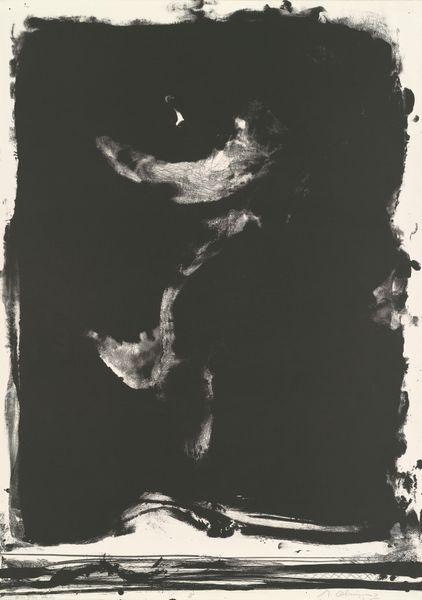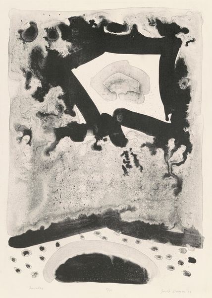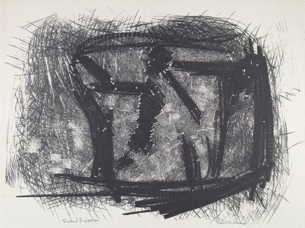
1961
Into Autumn
Listen to curator's interpretation
Curatorial notes
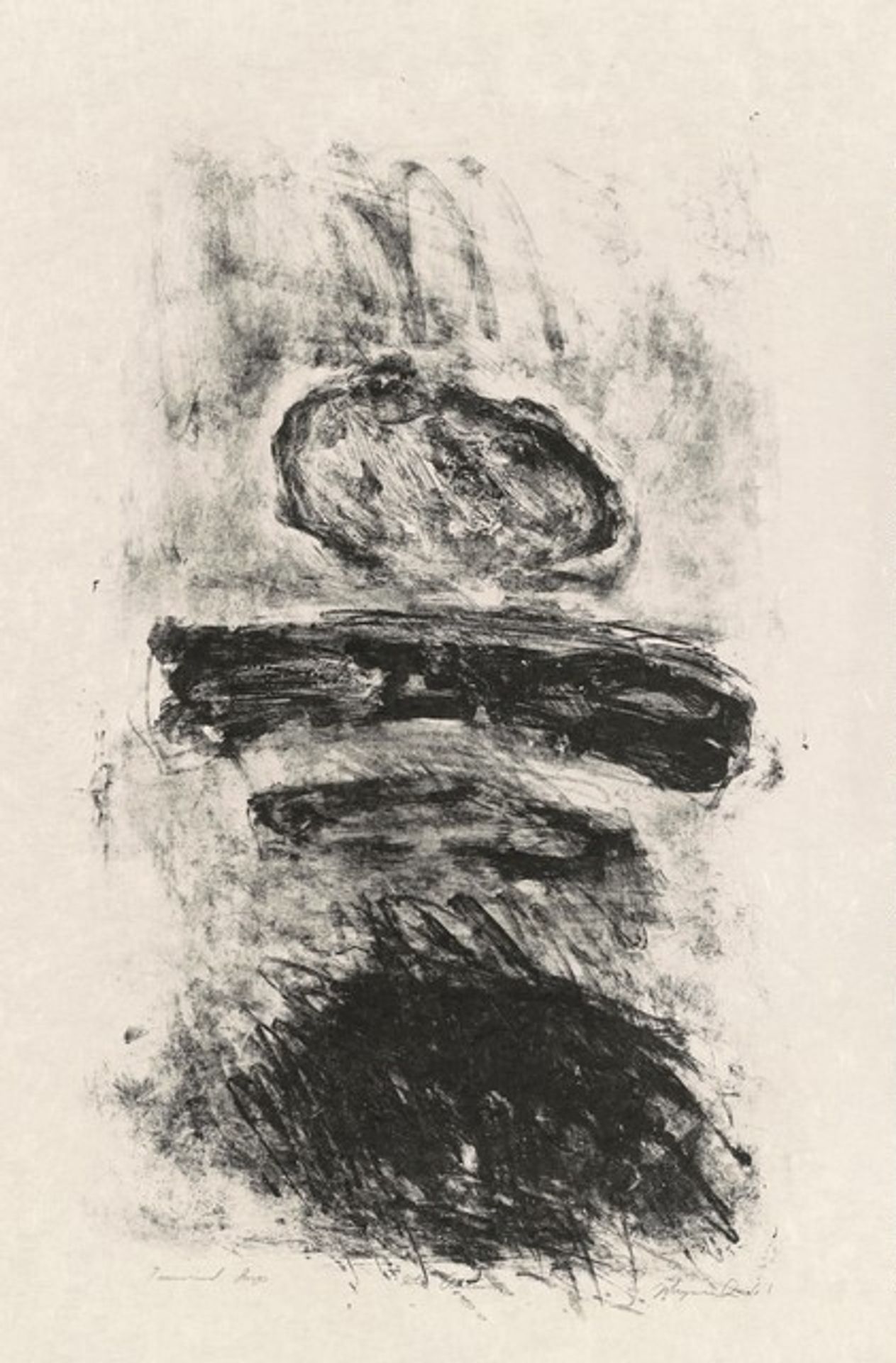
Editor: Here we have George Joji Miyasaki’s 1961 print, "Into Autumn," crafted using graphite. The stark monochrome palette immediately strikes me; it evokes a somber, almost desolate mood. What compositional elements stand out to you in this piece? Curator: What is most present is the work’s manipulation of form. Note the textures. See how the artist uses varied mark-making to create areas of intense darkness and subtle gradations of grey? Observe how these tonal shifts define the abstract shapes. What structural relationship do you observe in these forms? Editor: Well, they seem stacked, almost like cairns, but also unstable. The top oval seems precariously balanced. I am also struck by the gestural, almost violent, application of graphite, particularly in the bottom shape. Is this significant? Curator: Yes, I’d suggest examining the contrasting approaches. The controlled lines in the central bar juxtapose the chaotic scribbles below. This interplay is fundamental. We have an investigation into how meaning can be created through contrasting applications of mark-making alone. Consider the lines; consider the monochrome color. What is this tonal arrangement suggesting? Editor: It’s like the solid is decomposing, fragmenting into raw, untamed strokes of graphite. It’s dynamic, despite its stillness. I hadn’t considered how the technique itself was part of the content. Curator: Exactly. By considering these elements, the structure emerges to define the entire artistic investigation. It goes further than depicting a theme to actually becoming its subject. Editor: I see. Thank you for highlighting that. I'll certainly pay closer attention to materiality from now on.