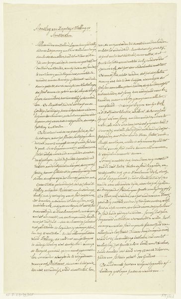
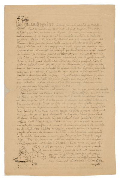
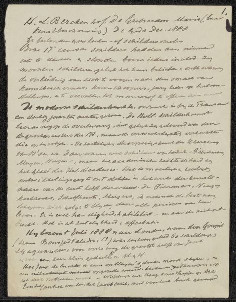
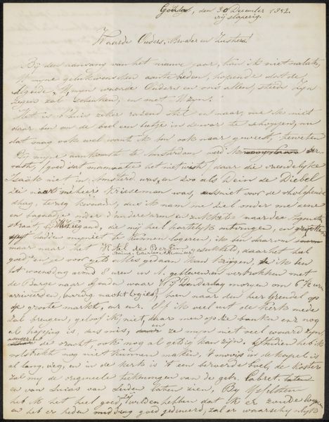
Transcriptie van een toelichting bij de vertoningen tijdens de intocht van koningin Henrietta Maria te Amsterdam, 1642 1875 - 1899
0:00
0:00
anonymous
Rijksmuseum
drawing, paper, ink
#
editorial cover design
#
drawing
#
magazine cover layout
#
aged paper
#
hand drawn type
#
paper
#
text
#
ink
#
fading type
#
thick font
#
handwritten font
#
classical type
#
word imagery
#
historical font
Dimensions: height 407 mm, width 238 mm
Copyright: Rijks Museum: Open Domain
Curator: Here at the Rijksmuseum, we have a fascinating piece entitled "Transcriptie van een toelichting bij de vertoningen tijdens de intocht van koningin Henrietta Maria te Amsterdam, 1642." It’s an anonymous drawing rendered in ink on paper, dating from 1875-1899. Editor: It strikes me as quite beautiful, the dense script giving it an almost textured quality, like woven threads of words. It is somewhat aged and fragile, wouldn’t you say? Curator: Indeed. Consider how the hand-drawn lettering constructs visual interest, thick lines contrasting with finer strokes, forming an intricate, almost abstract pattern. This plays with negative space and invites a rhythmic reading experience that transcends mere textual information. Editor: That “mere textual information,” as you put it, represents the power structures of its time. Henrietta Maria’s arrival would have been carefully orchestrated to convey particular messages about power and legitimacy, the transcript documenting that performance and then re-performed here as drawing decades later, layered in both representation and meaning. Who were these performances designed to exclude, and what narrative are these carefully handwritten words trying to construct about Dutch identity vis-à-vis this visiting Queen? Curator: It’s important to recognize the classical forms influencing the type. The clear, deliberate execution is self-referential. Editor: While acknowledging the careful construction of form, it’s also critical to remember how such performances of power serve ideological functions. Curator: Agreed, though one can still admire the composition without endorsing the content. Note the visual balance achieved despite the density of text. The calligraphic skill speaks for itself as a study of shape, rhythm, and the manipulation of line. Editor: For me, it’s a somber reminder of how even seemingly benign historical accounts can reflect and perpetuate social inequalities. It asks us to critically examine whose stories are told and how. Curator: I see your point. Examining this piece through both the lens of formal aesthetics and historical context certainly enriches our understanding. Editor: Precisely, the interaction between form and content opens up new avenues for interpretation, which seems entirely essential in these reflections.
Comments
No comments
Be the first to comment and join the conversation on the ultimate creative platform.
More like this