Dimensions: image: 89.5 x 64.5 cm (35 1/4 x 25 3/8 in.) sheet: 103.8 x 75.3 cm (40 7/8 x 29 5/8 in.)
Copyright: National Gallery of Art: CC0 1.0
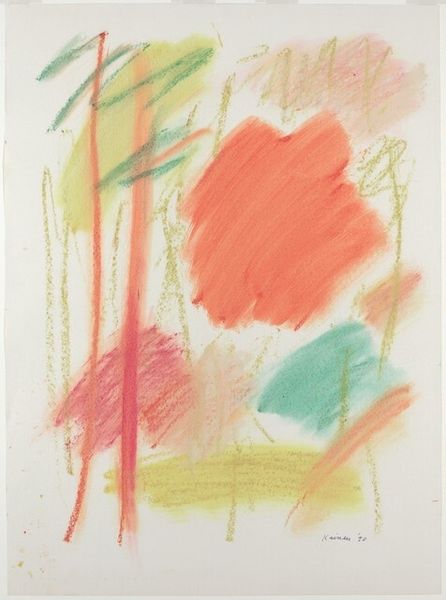
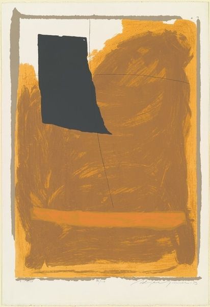
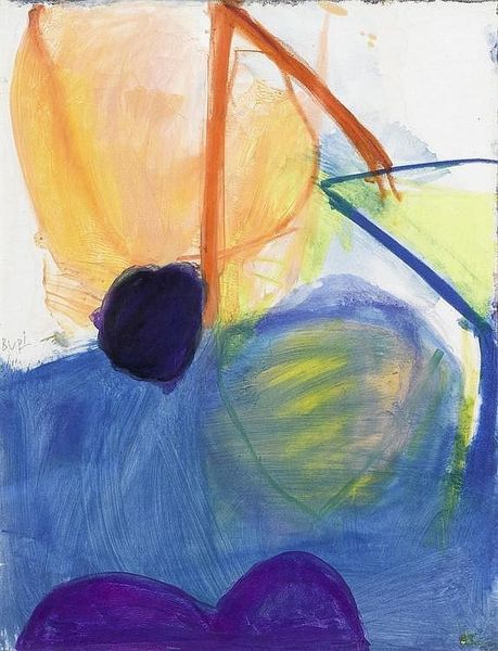
Curator: Jacob Kainen’s "Bright Surround," completed in 1989, employs both acrylic paint and printmaking techniques to explore a dynamic visual language. Editor: Well, it's aptly named. My first thought is 'playful'—the bright yellow background, the almost scribbled lines, the juxtaposition of the rigid, defined shapes with these loose, expressive marks, it really gives off a sense of lightheartedness. Curator: It’s interesting you pick up on that lightness. Kainen was deeply engaged with modernist ideas but also had a background in WPA printmaking. You see that tension in his approach to materials here, I think. The printmaking gives him that flatness and then the acrylic lets him build texture on top. Editor: Absolutely, but it also strikes me how deceptively simple the imagery seems. The two prominent circular forms – one a solid, assertive red, the other a subdued gray – immediately pull you in. The red, especially, could represent a life force, a sun perhaps? Curator: The sun as a recurring motif...fascinating. But what is it about the making process that lends itself to the expression of this archetype? The way Kainen layers colors in thin washes, it isn't about illusionism. The emphasis is on process and flatness rather than depth or perspective. Editor: Agreed, though it cannot be ignored that throughout history, circular shapes symbolize unity and completion; it might be reaching, but one could almost interpret the linear element, that thick, dominant green mark, as an echo of organic vitality rising between the contrasting spheres of color. Curator: An interesting idea, but perhaps its more relevant to examine the function of abstraction in Kainen's production, as this visual form moves to create a symbolic gesture or feeling without actually depicting tangible objects. The creation of space—how color activates it on the print. Editor: Point taken! But these color combinations evoke very specific, universal emotions. The energetic application almost feels raw, primitive even – like the earliest expressions of human symbolism. The interplay between intention and material...it offers such fertile ground for multiple readings. Curator: I appreciate how considering the interplay of form, intention and execution leads one to discover many facets in this one piece. Editor: Precisely. And now I feel as though I've seen those bright surrounds differently. Thank you.
Comments
No comments
Be the first to comment and join the conversation on the ultimate creative platform.
More like this