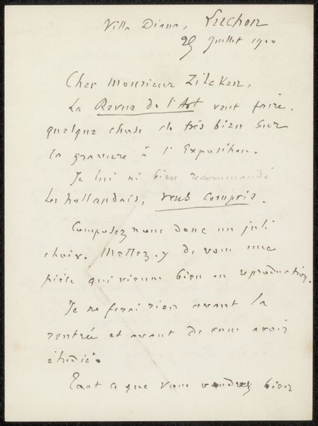
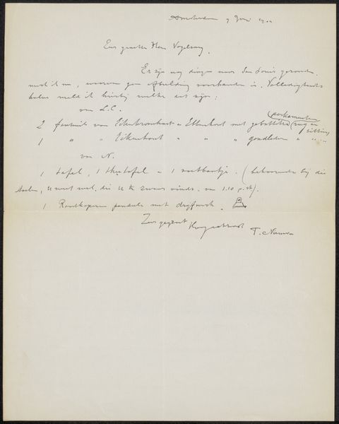
drawing, paper, ink, pen
#
pen and ink
#
drawing
#
ink drawing
#
paper
#
personal sketchbook
#
ink
#
ink drawing experimentation
#
pen
#
calligraphy
Copyright: Rijks Museum: Open Domain
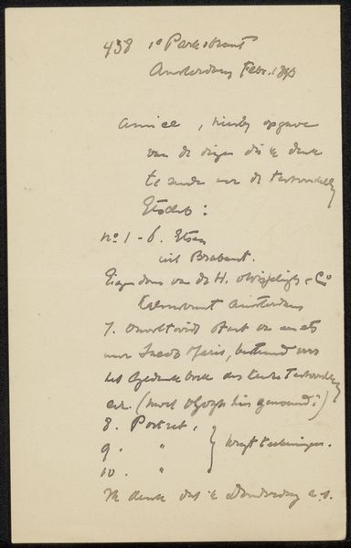
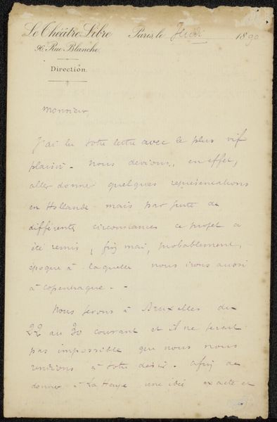
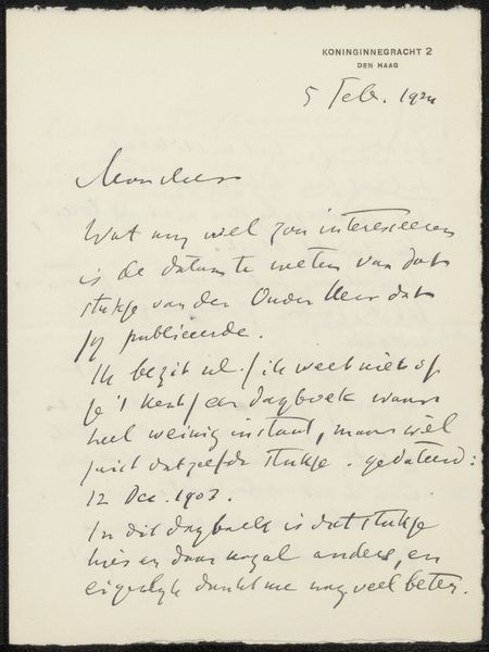
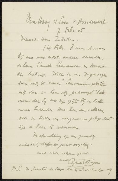
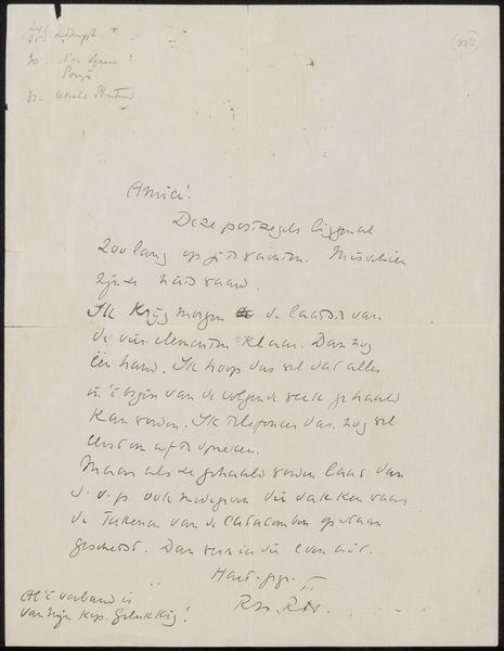
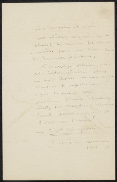
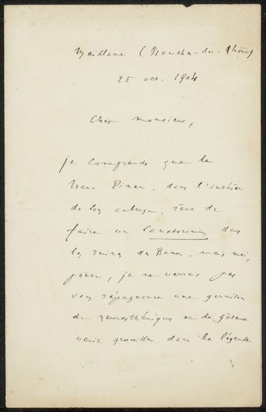
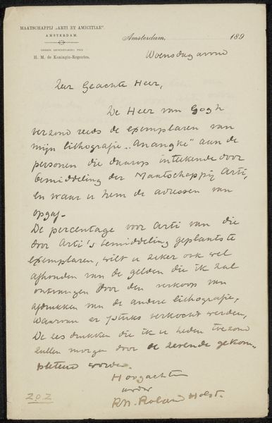
Curator: This is a fascinating piece by Hendrik Johannes Haverman entitled "Brief aan Pieter Haverkorn van Rijsewijk," created between 1883 and 1908. It's currently housed here at the Rijksmuseum. We see ink on paper, employing both pen and ink techniques. Editor: My initial response is a feeling of intimacy. The script is personal, informal—a peek into a private correspondence. It's all in sepia tones and feels muted. Curator: Absolutely. From a formal perspective, note how Haverman utilizes the page. The composition is deliberately asymmetrical; he allows for a generous top margin that really concentrates the textural density lower on the paper. This creates an interesting visual weight, almost grounding the work. Editor: And this grounding also carries a symbolic weight. Letters, for centuries, represented connection, relationship, news from afar. The act of handwriting itself imbues the object with the writer's personality and intent. Think of all that we’ve projected onto letters throughout time—secrets, promises, even declarations of war! Curator: Yes, the calligraphy itself is quite revealing. The loops and the sharp angles show a sense of deliberation alongside spontaneity. We see flourishes in some areas while other strokes appear rushed and functional, revealing layers of texture both literal and expressive. Editor: I'm drawn to the content. He seems to be writing about proof prints from lithographs to be sent and I detect the name 'Seam Bozmono' amidst the body. Perhaps an assistant. It grounds it in an important and specific cultural milieu of artistic creation. Curator: The use of Dutch text is a defining structural component, isn't it? While indecipherable to most modern viewers, the shapes of the letters, their arrangements into words, serve almost as an abstract design. And that paper too, the natural fibers catching the light. It's essential to the overall composition, don't you think? Editor: I do. But it also carries the implied weight of the sender and receiver, those involved in these exchanges and processes within a creative industry. Letters bind us together. Even now. Curator: Yes. Looking at it through this formal lens allows us to explore these interesting details in the execution of letterforms while appreciating its historic significance. Editor: It reminds us that visual art can live in all corners of life – in something as ubiquitous as handwritten letters, revealing social, professional, and psychological facets through carefully encoded, but emotionally charged, signs and gestures.
Comments
No comments
Be the first to comment and join the conversation on the ultimate creative platform.
More like this